First things first, load goodies and set up a theme.
|
1 2 3 4 5 6 7 8 9 10 11 12 13 14 15 16 |
##### Load Goodies ##### library(tidyverse) library(gridExtra) ##### Theme ##### theme_moma <- function(base_size = 12, base_family = "Helvetica") { theme( plot.background = element_rect(fill = "#F7F6ED"), legend.key = element_rect(fill = "#F7F6ED"), legend.background = element_rect(fill = "#F7F6ED"), panel.background = element_rect(fill = "#F7F6ED"), panel.border = element_rect(colour = "black", fill = NA, linetype = "dashed"), panel.grid.minor = element_line(colour = "#7F7F7F", linetype = "dotted"), panel.grid.major = element_line(colour = "#7F7F7F", linetype = "dotted") ) } |
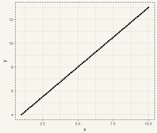
It is rare that a relationship between variables will be completely linear. It would be great to have a linear relationship like this equation \(y = x +3 \) with the chart like this.
|
1 2 3 4 5 6 |
##### Linear ###### x <- seq(from = 1, to = 10, by = 0.1) y <- x + 3 data <- data.frame(x,y) ggplot(data, aes(x,y)) + geom_point() + theme_moma() |
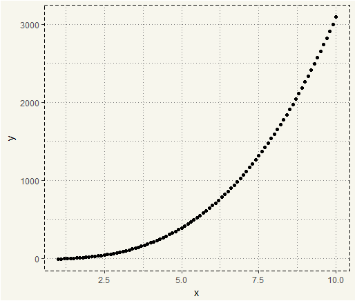
But, in practice, the relationship may be more like \(y = 3x^3+x^2+x-15\).
|
1 2 3 4 5 6 |
##### Polynomial ##### x <- seq(from = 1, to = 100, by = 0.1) y <- 3*x^3 + x^2 + x - 15 data <- data.frame(x,y) ggplot(data, aes(x,y)) + geom_point() + theme_moma() |
Using polynomial regression, in such case, could result in better predictive power. We will use diamonds data from the GGPLOT2 library to demonstrate the polynomial.
|
1 2 3 4 5 6 |
##### Diamonds ##### ggplot(diamonds, aes(y = price, x = x, col = as.numeric(clarity))) + geom_point(alpha = 0.05) + labs(col = "Clarity") + theme(legend.position = "none") + xlim(3,11) |
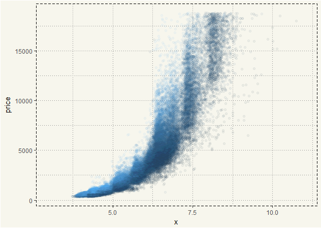
We can see that the relationship between price and x is not precisely linear. It is polynomial.
Let’s try GGPLOT2’s geom_smooth() function to fit models.
|
1 2 3 4 5 6 7 8 |
##### Linear ##### ggplot(diamonds, aes(y = price, x = x, col = as.numeric(clarity))) + geom_point(alpha = 0.05)+ geom_smooth(method = "lm", col = 'coral2', size = 1, linetype = 'dashed') + xlim(3,11) + ylim(0,20000) + theme(legend.position = "none") + ggtitle("Linear") |

|
1 2 3 4 5 6 7 8 9 10 |
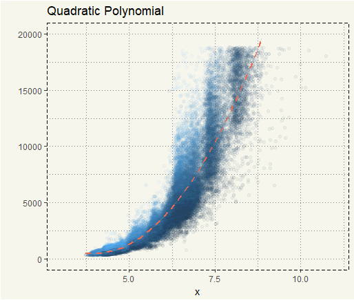
##### Quadratic ##### ggplot(diamonds, aes(y = price, x = x, col = as.numeric(clarity))) + geom_point(alpha = 0.05) + geom_smooth(method = "lm", formula = y ~ poly(x, 2), col = "coral2", size = 1, linetype = 'dashed') + xlim(3,11) + ylim(0,20000) + ylab("") + theme(legend.position = "none") + ggtitle("Quadratic Polynomial") + theme_moma() |
|
1 2 3 4 5 6 7 8 9 10 |
##### Cubic ##### ggplot(diamonds, aes(y = price, x = x, col = as.numeric(clarity))) + geom_point(alpha = 0.05) + geom_smooth(method = "lm", formula = y ~ poly(x, 3), col = "coral2", size = 1, linetype = 'dashed') + xlim(3,11) + ylim(0,20000) + ylab("") + theme(legend.position = "none") + ggtitle("Cubic Polynomial") + theme_moma() |
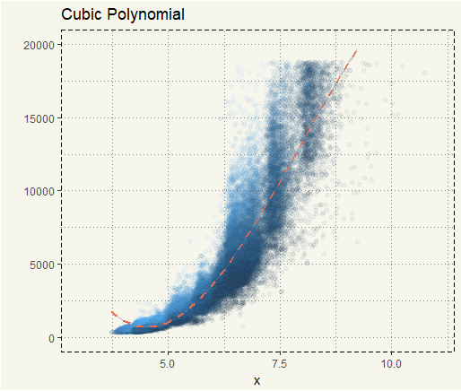
We can see that quadratic and cubic fits are much better than the linear fit. We can also use lm() to get the R-Squared.
|
1 2 3 4 |
##### LM ##### fit <- lm(price ~ x, data= diamonds) fit2 <- lm(price ~ poly(x,2), data = diamonds) fit3 <- lm(price ~ poly(x,3), data = diamonds) |
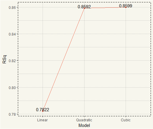
Then we extract only Adjusted R-Squared and plot the chart.
|
1 2 3 4 5 6 7 8 9 10 11 12 13 14 15 16 17 18 |
summary1 <- summary(fit) summary2 <- summary(fit2) summary3 <- summary(fit3) plot <- data.frame(Model = c("Linear","Quadratic","Cubic"), RSq = c(summary1$r.squared, summary2$r.squared, summary3$r.squared)) plot$Model <- factor(plot$Model, levels = c('Linear', 'Quadratic','Cubic')) ggplot(plot, aes(x = Model, y =RSq, group = 1)) + geom_line(col = 'coral2') + geom_point(col = 'coral2') + geom_text( aes(label = round(RSq,4)), position = position_dodge(0.9), vjust = 0) |