
This exploratory data analysis (EDA) aims to answer the following questions
1. What department had the highest percentage of attrition?
2. How many segments of attrition did the company have?
3. Did employees with high satisfaction or review tend to stay at the company? As they were satisfied with their jobs and got a good review, they would not want to leave, right?
4. Did people with high tenure would work the hardest as they are, well, experienced? Or in fact, those who worked hard were those with less experience?
5. When you worked more, got a good review, you were supposed to get paid more, right?
The dataset is posted at Kaggle (Link.) Assume that you are the CEO and HR is presenting this dataset and analysis to you; let’s see what we can do with it. But before the bread and butter, we need to do some prep works.
First, we need to load packages.
|
1 2 3 4 |
library(ggplot2) library(dplyr) library(gridExtra) library(scales) |
Next, let’s load the data and change it to a Tibble format.
|
1 2 |
data <- read.csv(Data\HR.csv, stringsAsFactors = T) #Read data data2 <- tbl_df(data) |
Now, let’s see what we have.
|
1 |
glimpse(data2) |
|
1 2 3 4 5 6 7 8 9 10 11 12 |
Observations: 14,999 Variables: 10 $ satisfaction_level <dbl> 0.38, 0.80, 0.11, 0.72, 0.37, 0.41, 0.10, 0.92, 0.89, 0.42, 0.45, 0.11, 0.84, 0.41,... $ last_evaluation <dbl> 0.53, 0.86, 0.88, 0.87, 0.52, 0.50, 0.77, 0.85, 1.00, 0.53, 0.54, 0.81, 0.92, 0.55,... $ number_project <int> 2, 5, 7, 5, 2, 2, 6, 5, 5, 2, 2, 6, 4, 2, 2, 2, 2, 4, 2, 5, 6, 2, 6, 2, 2, 5, 4, 2,... $ average_montly_hours <int> 157, 262, 272, 223, 159, 153, 247, 259, 224, 142, 135, 305, 234, 148, 137, 143, 160... $ time_spend_company <int> 3, 6, 4, 5, 3, 3, 4, 5, 5, 3, 3, 4, 5, 3, 3, 3, 3, 6, 3, 5, 4, 3, 4, 3, 3, 5, 5, 3,... $ Work_accident <int> 0, 0, 0, 0, 0, 0, 0, 0, 0, 0, 0, 0, 0, 0, 0, 0, 0, 0, 1, 0, 0, 0, 0, 0, 0, 0, 0, 0,... $ left <int> 1, 1, 1, 1, 1, 1, 1, 1, 1, 1, 1, 1, 1, 1, 1, 1, 1, 1, 1, 1, 1, 1, 1, 1, 1, 1, 1, 1,... $ promotion_last_5years <int> 0, 0, 0, 0, 0, 0, 0, 0, 0, 0, 0, 0, 0, 0, 0, 0, 0, 0, 1, 0, 0, 0, 0, 0, 0, 0, 0, 0,... $ sales <fctr> sales, sales, sales, sales, sales, sales, sales, sales, sales, sales, sales, sales... $ salary <fctr> low, medium, medium, low, low, low, low, low, low, low, low, low, low, low, low, l... |
We have 10 variables: 1 dependent (left) and 9 independents over 14,999 observations. As we will focus on EDA, I will change the name to be shorter so that I don’t have to type much and will change some integer variable to factor. Also, I will create a sorting function, chart position, and theme that will aid in visualization.
|
1 2 3 4 5 6 7 8 9 10 11 12 13 14 15 16 17 18 19 20 21 22 23 24 25 26 27 28 29 30 31 |
##### Change Column Name and a bit of lower-case##### data2 <- rename(data2, department = sales, accident = Work_accident, avg_mth_hrs = average_montly_hours, tenure = time_spend_company, promotions = promotion_last_5years) ##### Change to Factor ##### data2$number_project <- as.factor(data2$number_project) data2$accident <- as.factor(data2$accident) data2$left <- as.factor(data2$left) data2$promotions <- as.factor(data2$promotions) data2$tenure <- as.factor(data2$tenure) ##### Create Theme for GGPLOT2 ##### theme_moma <- function(base_size = 12, base_family = "Helvetica") { theme( plot.background = element_rect(fill = "#F7F6ED"), legend.key = element_rect(fill = "#F7F6ED"), legend.background = element_rect(fill = "#F7F6ED"), panel.background = element_rect(fill = "#F7F6ED"), panel.border = element_rect(colour = "black", fill = NA, linetype = "dashed"), panel.grid.minor = element_line(colour = "#7F7F7F", linetype = "dotted"), panel.grid.major = element_line(colour = "#7F7F7F", linetype = "dotted") ) } ##### Initiate Functoins and Constants ##### reorder_size <- function(x) { factor(x, levels = names(sort(table(x), decreasing = TRUE))) } dodgepos <- position_dodge(width=0.6) |
Okay. Let’s see the result.
|
1 |
glimpse(data2) |
|
1 2 3 4 5 6 7 8 9 10 11 12 |
Observations: 14,999 Variables: 10 $ satisfaction_level <dbl> 0.38, 0.80, 0.11, 0.72, 0.37, 0.41, 0.10, 0.92, 0.89, 0.42, 0.45, 0.11, 0.84, 0.41, 0.... $ last_evaluation <dbl> 0.53, 0.86, 0.88, 0.87, 0.52, 0.50, 0.77, 0.85, 1.00, 0.53, 0.54, 0.81, 0.92, 0.55, 0.... $ number_project <fctr> 2, 5, 7, 5, 2, 2, 6, 5, 5, 2, 2, 6, 4, 2, 2, 2, 2, 4, 2, 5, 6, 2, 6, 2, 2, 5, 4, 2, 2... $ avg_mth_hrs <int> 157, 262, 272, 223, 159, 153, 247, 259, 224, 142, 135, 305, 234, 148, 137, 143, 160, 2... $ tenure <fctr> 3, 6, 4, 5, 3, 3, 4, 5, 5, 3, 3, 4, 5, 3, 3, 3, 3, 6, 3, 5, 4, 3, 4, 3, 3, 5, 5, 3, 3... $ accident <fctr> 0, 0, 0, 0, 0, 0, 0, 0, 0, 0, 0, 0, 0, 0, 0, 0, 0, 0, 1, 0, 0, 0, 0, 0, 0, 0, 0, 0, 0... $ left <fctr> 1, 1, 1, 1, 1, 1, 1, 1, 1, 1, 1, 1, 1, 1, 1, 1, 1, 1, 1, 1, 1, 1, 1, 1, 1, 1, 1, 1, 1... $ promotions <fctr> 0, 0, 0, 0, 0, 0, 0, 0, 0, 0, 0, 0, 0, 0, 0, 0, 0, 0, 1, 0, 0, 0, 0, 0, 0, 0, 0, 0, 0... $ department <fctr> sales, sales, sales, sales, sales, sales, sales, sales, sales, sales, sales, sales, s... $ salary <fctr> low, medium, medium, low, low, low, low, low, low, low, low, low, low, low, low, low,... |
That’s better and shorter to type. Alright, before doing any EDA, let’s see if we have any missing values.
|
1 |
sum(is.na(data2) == TRUE) |
|
1 2 |
> sum(is.na(data2) == TRUE) [1] 0 |
Okay, 14,999 by 10… and there is no missing value… good. Let’s start by visualizing how many employees have left.
|
1 2 3 4 5 6 7 |
ggplot(data2, aes(x=left)) + geom_bar(aes(y=(..count..)/sum(..count..)), alpha=0.6) + scale_y_continuous(labels = scales::percent) + geom_text(aes(label = scales::percent((..count..)/sum(..count..)), y= (..count..)/sum(..count..) ), stat= "count", vjust = -0.5) + ylab("Percentage") + xlab("Attrition") + ggtitle("Attrition Percentage") + theme_moma() |

23% (3,571 employees) left the company. I wonder what department contributed to attrition. But before that, let’s take a look at the headcounts in each department.
|
1 2 3 4 5 6 7 8 |
ggplot(data2, aes(x = reorder_size(department))) + geom_bar(aes(y = (..count..)/sum(..count..)), alpha = 0.6, position = dodgepos) + scale_y_continuous(labels = scales::percent) + xlab("Department") + ylab("Percentage") + ggtitle("Headcount Percentage by Department") + geom_text(aes(label = scales::percent((..count..)/sum(..count..)), y= (..count..)/sum(..count..) ), stat= "count", vjust = -0.5) + theme_moma() |
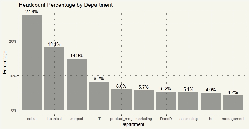
Hm, 28% of the entire company was in sales. I’d guess most of the attrition came from Sales department as the department is generally goal-driven, which could be a very convenient criterion for firing people. Let’s check the assumption.
|
1 2 3 4 5 6 7 8 9 10 11 12 13 14 15 |
data2 %>% select(department,left) %>% filter(left == 1) %>% group_by(department) %>% summarise(count=n()) %>% mutate(pct = count/sum(count)) %>% ggplot(aes(x=department, y=pct)) + geom_bar(stat="identity", alpha = 0.6) + scale_y_continuous(labels = scales::percent) + geom_text(aes(label = paste0(round(pct*100,0),"%"), y=pct+0.01)) + scale_fill_brewer(palette="Pastel1") + ylab("Percentage") + xlab("Department") + ggtitle("Attrition Contribution by Department") + theme_moma() |
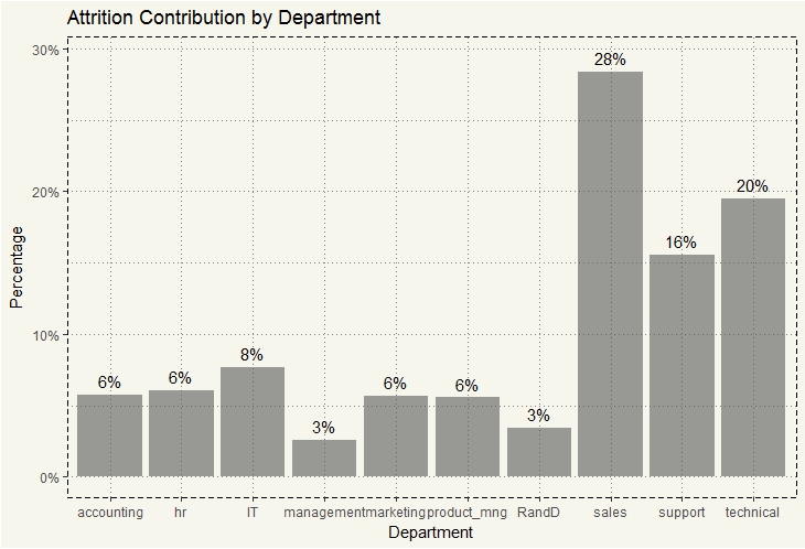
As expected… 28% of attrition came from the Sales department. But that is just one side of the story. We need to see the percentage of attrition within each department.
|
1 2 3 4 5 6 7 8 9 10 11 12 13 14 |
data2 %>% select(department,left) %>% group_by(department, left) %>% summarise(count=n()) %>% mutate(dep_pct = count/sum(count)) %>% ggplot(aes(x=department, y=dep_pct, fill = left)) + geom_bar(stat="identity", alpha = 0.6, position = dodgepos) + scale_y_continuous(labels = scales::percent) + geom_text(aes(label = paste0(round(dep_pct*100,0),"%"), y=dep_pct+0.02)) + ylab("Percentage") + xlab("Department") + theme(legend.position = "bottom") + ggtitle("Attrition per Department") + theme_moma() |
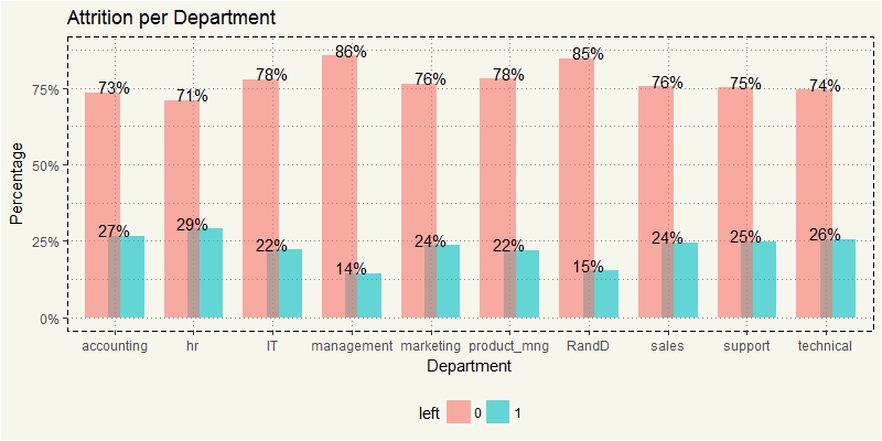
Well, it turned out that, Sales was not so bad after all. But only 14% attrition in Management? Well, no doubt about it. :-/ HR was interesting as it had the highest attrition rate.
Now let’s focus on those who left the company. Let’s take a look at 4 variables that should give some hints with the following assumptions:
- Satisfaction: Lower satisfaction, more likely to quit
- No. of Project: Too many projects, more likely to quit
- Last Evaluation: Lower last evaluation, more likely to quit
- Avg Mth Hours: High hours, more likely to quit
First, let’s see Satisfaction and Number of Project.
|
1 2 3 4 5 6 7 |
c1 <-ggplot(data2, aes(x=satisfaction_level)) + geom_bar(stat="count", aes(fill = left), alpha = 0.6) + xlab("Satisfaction Level") + theme(legend.position="none") + ggtitle("Satisfaction Level") + theme_moma() c2 <-ggplot(data2, aes(x=number_project)) + geom_bar(stat="count", aes(fill = left), alpha = 0.6) + xlab("Number of Project") + ggtitle("Number of Project") + ylab("") + theme_moma() grid.arrange(c1,c2, nrow=1) |
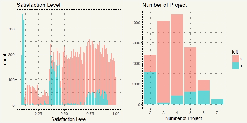
Oh, that’s a bingo. Haha. Yikes. It seems like the healthiest number of a project is 3. The more the projects, the higher the attrition rate. What about Hours and Evaluation?
|
1 2 3 4 5 6 7 |
c3 <-ggplot(data2, aes(x=last_evaluation)) + geom_bar(stat="count", aes(fill = left), alpha = 0.6) + xlab("Last Evaluation") + theme(legend.position="none") + ggtitle("Last Evaluation") + theme_moma() c4 <-ggplot(data2, aes(x=avg_mth_hrs)) + geom_bar(stat="count", aes(fill = left), alpha = 0.6) + xlab("Average Hours") + ggtitle("Average Hours") + ylab("") + theme_moma() grid.arrange(c3,c4, nrow=1) |
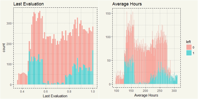
Oh, that is interesting. Many of the assumptions turned out to be correct. But there also are some surprising results: Employees with high satisfaction and high evaluation quit. In addition to Satisfaction and Evaluation, those with relatively low work hours also quit.
Let’s create charts that combine 5 features (Department, Evaluation, Number of Project, Left, and Satisfaction Level.) I’ll assign the Satisfaction Level to the size: the bigger, the happier and vice versa. First, let’s try with HR.
|
1 2 3 4 5 6 7 8 |
c5 <- data2 %>% filter(department == "hr") %>% ggplot(aes(y=last_evaluation, x=number_project, col = left, size=satisfaction_level)) + geom_jitter(alpha=0.3) + theme(legend.position="none") + ggtitle("HR") + ylab("Last Evaluation") + xlab("Number of Project") + theme_moma() c5 |
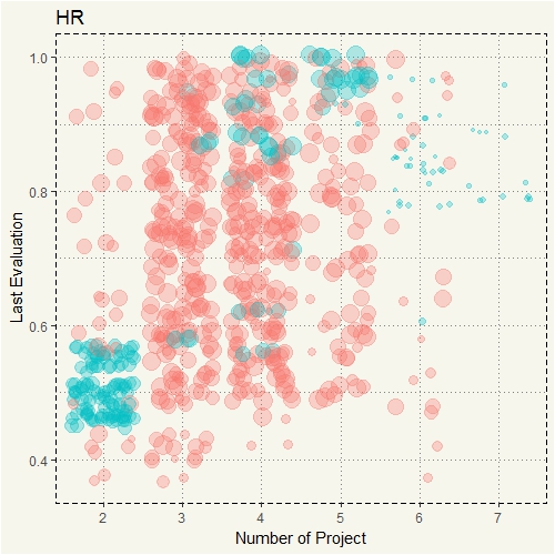
Oh, now we know why people who worked 7 projects quit… they were unhappy! The size of the jitters is significantly different from the rest. Let’s compare HR with Sales.
|
1 2 3 4 5 6 7 8 9 |
#Sales c6 <- data2 %>% filter(department == "sales") %>% ggplot(aes(y=last_evaluation, x=number_project, col = left, size=satisfaction_level)) + geom_jitter(alpha=0.3) + ggtitle("Sales") + ylab("") + xlab("Number of Project") + theme(legend.position="none") + theme_moma() grid.arrange(c5,c6, nrow=1) |

Yep, that’s the same story. Now we know that the magic quadrants are upper right and bottom left. Let’s see if other departments also had the same pattern.
|
1 2 3 4 5 6 7 8 9 10 11 12 13 14 15 16 17 |
#accounting c7 <- data2 %>% filter(department == "accounting") %>% ggplot(aes(y=last_evaluation, x=number_project, col = left, size=satisfaction_level)) + geom_jitter(alpha=0.3) + theme(legend.position="none") + ggtitle("Accounting") + ylab("Last Evaluation") + xlab("Number of Project") + theme_moma() #IT c8 <- data2 %>% filter(department == "IT") %>% ggplot(aes(y=last_evaluation, x=number_project, col = left, size=satisfaction_level)) + geom_jitter(alpha=0.3) + theme(legend.position="none") + ggtitle("IT") + ylab("") + xlab("Number of Project") + theme_moma() grid.arrange(c7,c8, nrow=1) |
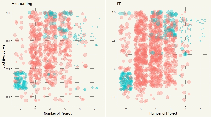
Okay, Accounting and IT had the same pattern. What about Marketing and Technical?
|
1 2 3 4 5 6 7 8 9 10 11 12 13 14 15 16 17 |
#marketing c9 <- data2 %>% filter(department == "marketing") %>% ggplot(aes(y=last_evaluation, x=number_project, col = left, size=satisfaction_level)) + geom_jitter(alpha=0.3) + theme(legend.position="none") + ggtitle("Marketing") + ylab("Last Evaluation") + xlab("Number of Project") + theme_moma() #techinal c10 <- data2 %>% filter(department == "technical") %>% ggplot(aes(y=last_evaluation, x=number_project, col = left, size=satisfaction_level)) + geom_jitter(alpha=0.3) + theme(legend.position="none") + ggtitle("Technical") + ylab("") + xlab("Number of Project") + theme_moma() grid.arrange(c9,c10,nrow=1) |

Same old pattern, let’s take a look at the other 4 departments.
|
1 2 3 4 5 6 7 8 9 10 11 12 13 14 15 16 17 |
#Product Management c11 <- data2 %>% filter(department == "product_mng") %>% ggplot(aes(y=last_evaluation, x=number_project, col = left, size=satisfaction_level)) + geom_jitter(alpha=0.3) + theme(legend.position="none") + ggtitle("Product Management") + ylab("Last Evaluation") + xlab("Number of Project") + theme_moma() #Support c12 <- data2 %>% filter(department == "support") %>% ggplot(aes(y=last_evaluation, x=number_project, col = left, size=satisfaction_level)) + geom_jitter(alpha=0.3) + theme(legend.position="none") + ggtitle("Support") + ylab("") + xlab("Number of Project") + theme_moma() grid.arrange(c11,c12,nrow=1) |

|
1 2 3 4 5 6 7 8 9 10 11 12 13 14 15 16 17 |
#Management c13 <- data2 %>% filter(department == "management") %>% ggplot(aes(y=last_evaluation, x=number_project, col = left, size=satisfaction_level)) + geom_jitter(alpha=0.3) + theme(legend.position="none") + ggtitle("Management") + ylab("Last Evaluation") + xlab("Number of Project") + theme_moma() #R&D c14 <- data2 %>% filter(department == "RandD") %>% ggplot(aes(y=last_evaluation, x=number_project, col = left, size=satisfaction_level)) + geom_jitter(alpha=0.3) + theme(legend.position="none") + ggtitle("R&D") + ylab("") + xlab("Number of Project") + theme_moma() grid.arrange(c13,c14,nrow=1) |
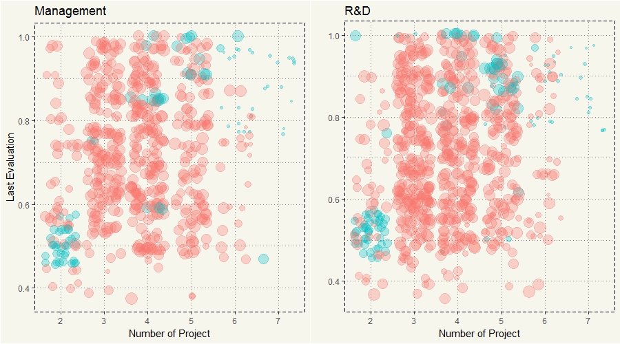
Yep, every department had the same pattern. However, if you take a look closely, you would see that there is a huge chunk of quitters at 4 to 5 projects; it is most apparent technical. I could just use Dplyr to filter only quitters and redo the chart. But I think the chart below is better at visualizing.
There we go, there is actually 3 clusters of attrition. First, those with high evaluation but low satisfaction. Second, those with high evaluation and high satisfaction. Third, low evaluation but high satisfaction. At this point, I’d guess those who worked more were top performers and unhappy as they overworked… so they just quit. It makes sense, right? If you are good, you should be able to get a new job anyway. While the second group may have just got bored and got an offer that they could refuse (sounds familiar?) While the last group who worked on only 2 projects and got low evaluation were, unfortunately, forced out or fired.
Come to think about it… we have a Tenure feature. I am just curious about compensation and tenure. I mean, if I were to work 7 projects and got paid half a million, really, I may just suck it up for a couple of years and retire. Generally, those who work more, should get paid more, right?
|
1 2 3 4 |
ggplot(data2, aes(x=number_project, y=last_evaluation, col=salary)) + geom_jitter(alpha=0.3) + xlab("Number of Project") + ylab("Last Evaluation") + ggtitle("Work More, Get Paid More... Yes?") + theme(legend.position = "bottom") + theme_moma() |

Oh, that sucks! No doubt they quit! Look at those red dots; they only work on 3 to 5 projects. Tenure should come into play. My guess is those youngsters had to work on many projects and got paid low, while those with many years of work experience worked on fewer projects but got paid much higher
|
1 2 3 4 5 6 |
data2 %>% ggplot(aes(x=as.integer(number_project), col=tenure, fill=tenure)) + geom_density(alpha=0.1) + facet_grid(.~tenure) + xlab("Number of Project") + xlim(2,7) + theme(legend.position = "bottom") + theme_moma() + theme(panel.grid.minor = element_blank(), panel.grid.major = element_blank()) |

Well, look at that. Those with 4 to 6 years of tenure were like in their prime (in a bad way.) While the newcomers got to work only on few projects as probably due to being new. While those with 6 or more years of tenure worked very few… sounds super familiar.
But wait, if those labors didn’t get paid high, who, then, got fat checks? I wonder what it would look like if we find salary percentage in each department.
|
1 2 3 4 5 6 7 8 9 10 11 12 13 14 |
data2 %>% select(department, salary) %>% group_by(department, salary) %>% summarise(count=n()) %>% mutate(sal_pct = count/sum(count)) %>% ggplot(aes(x=department, y = sal_pct, fill = salary)) + geom_bar(stat="identity", alpha = 0.5, position = dodgepos) + scale_y_continuous(labels = scales::percent) + geom_text(aes(label = paste0(round(sal_pct*100,0),"%"), y=sal_pct+0.02), position = position_dodge(0.9)) + ylab("Percentage") + xlab("Department") + ggtitle("Salary by Department") + theme(legend.position = "bottom") + theme_moma() |

Of course, Management!!
By this time we should be able to answer the questions
- What department had the highest percentage of attrition?
HR at 29%, Accounting at 27%, Technical at 26% - How many segments of attrition did the company have?
There are 3 types of attrition. First, top performers. These employees were assigned to work on too many projects eventually resulting in unhappiness and attrition. Second, boredom. These employees were happy at work and got good evaluation, but they quit probably due to boredom of doing the same works. Third, under performers. These employees got low evaluation and worked on few projects. They probably got forced out. - Did employees with high satisfaction or review tend to stay at the company? As they were satisfied with their jobs and got a good review, they would not want to leave, right? Nope! Not at all. It appears that there were 2 types of resigned top performers. First, those that were assigned to too many projects resulting in low satisfaction and resignation. Second, those with high satisfaction but resigned due to, well, probably an offer that they could not refuse from other companies.
- Did people with high tenure would work the hardest as they are, well, experienced? Or in fact, those who worked hard were those with less experience? No, they didn’t work the hardest. Those who worked hardest were those with 4 to 6 years of tenure.
- When you worked more, got a good review, you were supposed to get paid more, right? Well, that couldn’t be further from the truth. Those who worked on 7 projects despite getting high review got paid either low or medium. In every department, the percentage of those who got paid “high” was between 6 % and 10% only. But guess what, 36% of management got paid “high.” Surprise! Surprise!