This Exploratory Data Analysis (EDA) aims to identify the top 3 features that correlate to the SalePrice by breaking down into each 5 MSZoning. The dataset is published through Kaggle (link)
Before we do anything, we need to load libraries, set work directory, load data, and create a theme.
|
1 2 3 4 5 6 7 8 9 10 11 12 13 14 15 16 17 18 19 20 21 22 23 24 25 26 27 28 29 30 31 |
##### Load Libraries ##### library(dplyr) library(ggplot2) library(scales) library(gridExtra) library(corrplot) ##### Set WD ##### setwd('C:/Users/House Prices/') ##### Load Data ##### train <- tbl_df(read.csv('train (1).csv')) test <- tbl_df(read.csv('test.csv')) ##### Reorder Function ##### reorder <- function(x) { factor(x, levels = names(sort(table(x), decreasing = TRUE))) } ##### Theme Moma ##### theme_moma <- function(base_size = 12, base_family = "Helvetica") { theme( plot.background = element_rect(fill = "#F7F6ED"), legend.key = element_rect(fill = "#F7F6ED"), legend.background = element_rect(fill = "#F7F6ED"), panel.background = element_rect(fill = "#F7F6ED"), panel.border = element_rect(colour = "black", fill = NA, linetype = "dashed"), panel.grid.minor = element_line(colour = "#7F7F7F", linetype = "dotted"), panel.grid.major = element_line(colour = "#7F7F7F", linetype = "dotted") ) } |
First of all, let’s glimpse at the data
|
1 2 |
##### GLIMPSE ##### glimpse(train) |
|
1 2 3 4 5 6 7 8 |
> ##### GLIMPSE ##### > glimpse(train) Observations: 1,460 Variables: 81 $ Id <int> 1, 2, 3, 4, 5, 6, 7, 8, 9, 10 $ MSSubClass <int> 60, 20, 60, 70, 60, 50, 20, 60 $ MSZoning <fctr> RL, RL, RL, RL, RL, RL, RL, RL $ LotFrontage <int> 65, 80, 68, 60, 84, 85, 75, NA |
Hm, only 1,460 rows but with 81 columns excluding predictor and ID, then we only have 79 predictors. We have 43 factor variables and 36 integer variables.
Let’s check missing values
|
1 2 |
##### Missing Value ##### sum(is.na(train)) |
|
1 2 3 |
> ##### Missing Value ##### > sum(is.na(train)) [1] 6965 |
Well, 6,965 is a whole lot of NA. We need to pinpoint what features they belong.
|
1 2 |
##### Missing Value - 2#### colSums(sapply(train, is.na)) |
|
1 2 3 4 5 6 7 8 9 10 11 12 13 14 15 16 17 18 19 20 |
> ##### Missing Value - 2#### > colSums(sapply(train, is.na)) Id MSSubClass MSZoning LotFrontage LotArea Street Alley LotShape LandContour 0 0 0 259 0 0 1369 0 0 Utilities LotConfig LandSlope Neighborhood Condition1 Condition2 BldgType HouseStyle OverallQual 0 0 0 0 0 0 0 0 0 OverallCond YearBuilt YearRemodAdd RoofStyle RoofMatl Exterior1st Exterior2nd MasVnrType MasVnrArea 0 0 0 0 0 0 0 8 8 ExterQual ExterCond Foundation BsmtQual BsmtCond BsmtExposure BsmtFinType1 BsmtFinSF1 BsmtFinType2 0 0 0 37 37 38 37 0 38 BsmtFinSF2 BsmtUnfSF TotalBsmtSF Heating HeatingQC CentralAir Electrical X1stFlrSF X2ndFlrSF 0 0 0 0 0 0 1 0 0 LowQualFinSF GrLivArea BsmtFullBath BsmtHalfBath FullBath HalfBath BedroomAbvGr KitchenAbvGr KitchenQual 0 0 0 0 0 0 0 0 0 TotRmsAbvGrd Functional Fireplaces FireplaceQu GarageType GarageYrBlt GarageFinish GarageCars GarageArea 0 0 0 690 81 81 81 0 0 GarageQual GarageCond PavedDrive WoodDeckSF OpenPorchSF EnclosedPorch X3SsnPorch ScreenPorch PoolArea 81 81 0 0 0 0 0 0 0 PoolQC Fence MiscFeature MiscVal MoSold YrSold SaleType SaleCondition SalePrice 1453 1179 1406 0 0 0 0 0 0 |
The majority of NAs (5,407 out of 6,965 or 77%) is from Alley, PoolQC, Fence, MiscFeature. According to the data dictionary, NA in those categories indicates that they simply just don’t have the feature. For the EDA purpose, I will just keep them in. But I will remove them from Machine Learning step.
Let’s wait no more, let’s see the graphs and charts!
|
1 2 3 4 5 6 7 8 9 10 11 12 13 14 15 16 17 18 19 |
##### Box Plot ##### z1 <- train %>% ggplot(aes(x = MSZoning, y = SalePrice)) + geom_boxplot() + scale_y_continuous(labels= scales::dollar) + theme_moma() + ggtitle("Boxplot by Price") z2 <- train %>% ggplot(aes(x = reorder(MSZoning))) + geom_bar(aes(y=(..count..)/sum(..count..))) + scale_y_continuous(labels = scales::percent) + geom_text(aes(label = scales::percent((..count..)/sum(..count..)), y= (..count..)/sum(..count..) ), stat= "count", vjust = -0.5) + theme_moma() + ylab("Count") + xlab("MSZoning") + ggtitle("Count by MSZoning") grid.arrange(z1,z2,nrow = 1) |
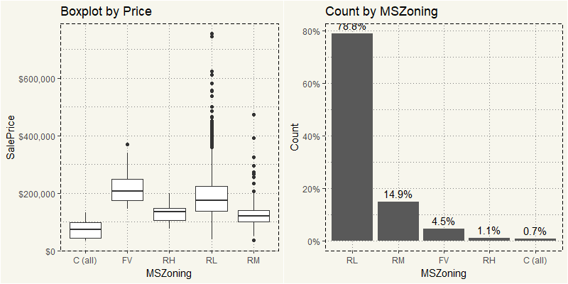
Almost 80% of the data is from RL or Residential Low Density. In term of price, RL also has the most outliers.
When it is the time for ML, I am quite inclined to break them down into MSZoning and run the technique to each MSZoning type. We sure can apply the log transformation to the entire dataset. But 20% of the data is somewhat fine. But we will see.
Let’s look at another view of those outliers
|
1 2 3 4 5 6 7 8 9 10 11 12 13 |
z3 <- train %>% ggplot(aes(x=SalePrice, col=MSZoning, fill=MSZoning)) + geom_density(alpha=0.1) + theme(legend.position = "bottom") + theme_moma() + scale_x_continuous(labels=comma) z4 <- train %>% ggplot(aes(x =SalePrice, fill = MSZoning)) + geom_histogram(stat = "bin", alpha = 0.5) + theme(legend.position = "bottom") + theme_moma() + scale_x_continuous(labels=comma) grid.arrange(z3,z4,nrow = 1) |
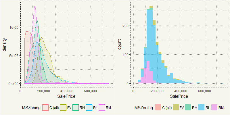
Most of the selling price is between $100,000 and $200,000 which represented by RL. Yet RL in the density plot has a long tail due to outliers. As RL influences the dataset and represents 78% of the dataset, we should spend most of our time on it. But before that, there are a couple of variables that is glaringly influential: Lot Area, OverallQual, OverallCond, LotArea, and YearRemodel.
Let’s take a look at Overall Qual and Overall Cond.
|
1 2 3 4 5 6 7 8 9 10 11 12 13 14 15 16 17 18 19 |
##### Quality VS Condition ##### z5 <- train %>% ggplot(aes(y = SalePrice, x = as.factor(OverallQual))) + geom_boxplot() + theme_moma() + xlab("Overall Quality") + scale_y_continuous(labels = scales::dollar) + ggtitle("Overall Quality") z6 <- train %>% ggplot(aes(y = SalePrice, x = as.factor(OverallCond))) + geom_boxplot() + theme_moma() + xlab("Overall Condition") + ylab("") + scale_y_continuous(labels= scales::dollar) + ggtitle("Overall Condition") grid.arrange(z5,z6,nrow = 1) |

Yes, the correlation is super clear: the higher the quality, the better sales prices. However, OverallCond does not exhibit the clear pattern as OverallQual. These two qualities are very different. OverallQual indicates the quality of material and finish of the house, which I think are the heart and soul of a house. OverallCond, on the contrary, indicates the overall condition of a house. So you may get a pristine clean house but made by asbestos materials which should get a high score on OverallCond but super low on OverallQual. On the contrary, there could be a house made from concrete with some mold on a wall, which should get a high score on OverallQual but low on OverallCond.
So far so good, what about LotArea?
|
1 2 3 4 5 6 7 8 9 10 11 12 13 14 15 16 17 18 19 20 21 22 23 |
##### Lot Area ##### z7 <- train %>% ggplot(aes(y = SalePrice, x = LotArea)) + geom_point(alpha = 0.1) + theme_moma() + xlab("Log(Lot Area)") + scale_y_continuous(labels = scales::dollar) + ggtitle("Log(Lot Area) and SalePrice") + scale_x_log10(labels = scales::comma) + geom_smooth(method= "loess") z8 <- train %>% ggplot(aes(y = SalePrice, x = LotArea, fill = MSZoning)) + geom_point(alpha = 0.1) + theme_moma() + xlab("Log(Lot Area)") + ylab("") + scale_y_continuous(labels = scales::dollar) + ggtitle("Log(Lot Area) and SalePrice") + scale_x_log10(labels = scales::comma) + geom_smooth(method= "loess") grid.arrange(z7,z8,nrow = 1) |
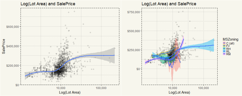
On the left side, you can see that overall higher LotArea will lead to the higher sales price. The exception is in “C (all)” category in which the price seems to wiggle up and down. But for the rest MSZoning category, the intuition applies.
The last numerical variable that we will take a look is YearRemodAdd. If there is no remodeling, the YearRemodAdd will be the same as YearBuilt. A pretty clean data indeed.
|
1 2 3 4 5 6 7 8 9 10 |
##### Year Remodel ##### train %>% ggplot(aes(y = SalePrice, x = as.factor(YearRemodAdd))) + geom_boxplot() + theme_moma() + xlab("Remodelled Year") + ylab("Sale Price") + scale_y_continuous(labels = scales::dollar) + ggtitle("Remodelled Year and Sale Price") + theme(axis.text.x = element_text(angle=45,vjust= 0.5, size = 8)) |
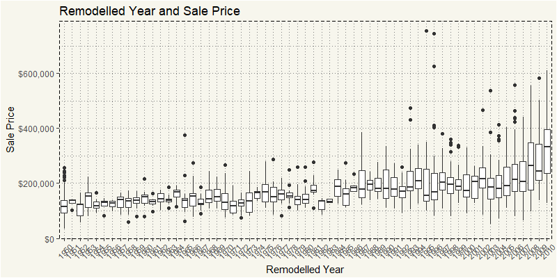
The newer, the better!
At this point, we have an overall understanding of influential variables. We could have looked at the overall data through correlation diagram. But before that, I want to focus on RL outliers. Let’s create a new dataset.
|
1 2 |
EDA_RL <- train %>% filter(MSZoning == "RL") |
Let’s take a look at the SalePrice and LotArea.
|
1 2 3 4 5 6 7 8 9 |
EDA_RL %>% ggplot(aes(y = SalePrice, x = LotArea, fill = MSZoning)) + geom_point() + theme_moma() + xlab("Lot Area") + ylab("Sale Price") + scale_y_continuous(labels = scales::dollar) + ggtitle("Log(Lot Area) and SalePrice") + <span class="n"> theme</span><span class="p">(</span><span class="n">legend.position</span><span class="o">=</span><span class="s2"><span class="hljs-string">"none"</span></span><span class="p">)</span> |
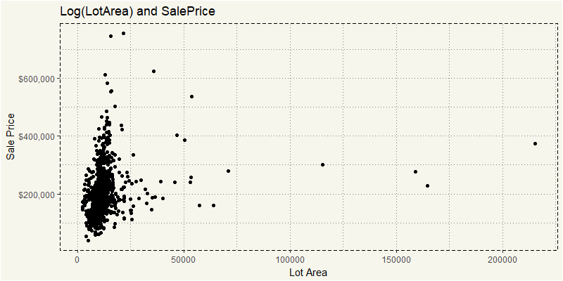
I kind of understand those super outliers. But if you really take a look where the cluster is and ignore outliers. This code should be better in revealing them.
|
1 2 3 4 5 6 7 8 9 10 |
EDA_RL %>% filter(LotArea <= 50000) %>% ggplot(aes(y = SalePrice, x = LotArea, fill = MSZoning)) + geom_point() + theme_moma() + xlab("Lot Area") + ylab("Sale Price") + scale_y_continuous(labels = scales::dollar) + ggtitle("LotArea and SalePrice") + theme(legend.position="none") |
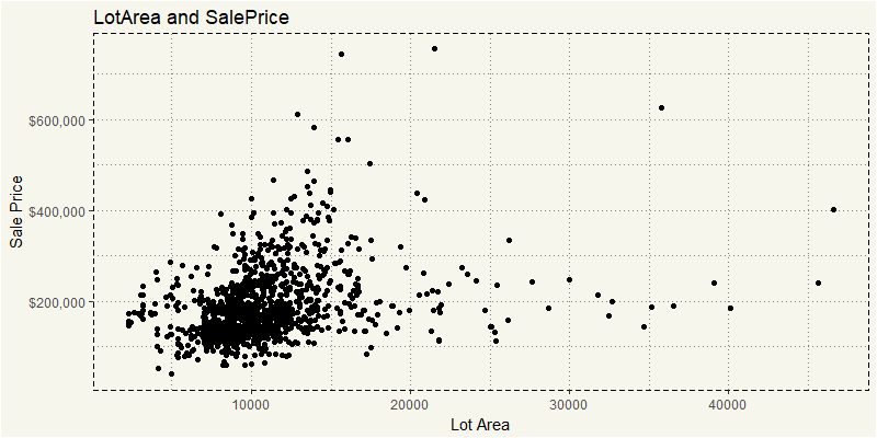
What I am interested is why those with more than 20,000 lot area are sold lower than those with less than 20,000. Yeah, I know, there must be some features that separate them apart. Let’s take a look at them!
|
1 2 3 4 5 6 7 8 9 10 11 |
EDA_RL %>% filter(LotArea <= 50000) %>% ggplot(aes(y = SalePrice, x = LotArea, col = as.factor(YearRemodAdd), alpha=0.2)) + geom_point() + theme_moma() + xlab("Lot Area") + ylab("Sale Price") + scale_y_continuous(labels = scales::dollar) + ggtitle("LotArea, SalePrice, and Remodelled Year") |
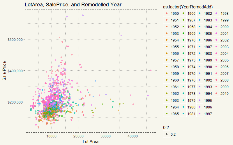
Wow, that is easy to see. Houses that were sold higher than $300,000 were built after 1990, while those with more space was built way earlier than 1990. Hm, that is sure interesting. However, the year built itself may just be the sign of some underlying features. Say… could it be the swimming pool? Or could it be some construction type that is only available after 1990?
|
1 2 3 4 5 6 7 8 9 10 11 |
EDA_RL %>% filter(LotArea <= 50000) %>% ggplot(aes(y = SalePrice, x = LotArea, col = as.factor(PoolArea), alpha=0.2)) + geom_point() + theme_moma() + xlab("Lot Area") + ylab("Sale Price") + scale_y_continuous(labels = scales::dollar) + ggtitle("PoolArea and SalePrice") |
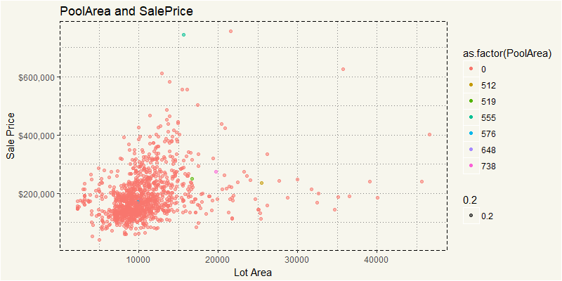
No, the pool is not a factor. Well, we could repeat this with another 80 variables. Yuck. This is the time when statistical significance or PCA come into play. Too many variables? No problema. But I’d cover that in Machine Learning section. For now, I’d like to focus on pure EDA approach… another tool is correlation matrix. Unfortunately, correlation works with numeric variables and without NA only. So we will select only numeric variables without NAs.
|
1 2 3 |
EDA_RL_N <- EDA_RL %>% select(4,5,18,19,20,21,27,35,37,38,39,44:53, 55,57,60,62,63,67:72,76,77,78,81) |
Now it’s time to run the correlation plot.
|
1 |
corrplot(cor(EDA_RL_N),method="color",tl.cex=0.7) |
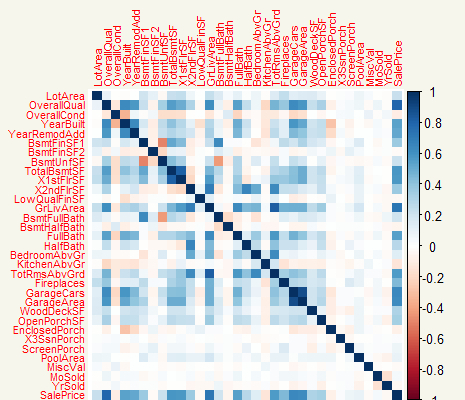
OverallQual is for sure has very high correlation with the SalePrice. YearRemodel, TotalBmstSF also have strong correlations. Although we can change the syntax in the correplot(), I am only interested in the correlation to the SalePrice. Hm, let’s just extract the column and use GGPLOT.
|
1 2 3 4 5 6 7 8 9 10 11 12 13 14 |
z_rl <- cor(EDA_RL_N) z_rl2 <- as.data.frame(z_rl[,36]) feature <- rownames(z_rl2) z_rl2 <- cbind(feature=feature,z_rl2) z_rl2$MSZoning <- "RL" names(z_rl2)[names(z_rl2)=="z_rl[, 36]"] <- "value" ggplot(z_rl2, aes(x=feature,y=value)) + geom_bar(stat="identity") + theme_moma() + xlab("Feature") + ylab("Correlation Coefficient") + ggtitle("RL - Correlation Plot") + theme(axis.text.x = element_text(angle=45, hjust=1, size = 8)) |

That’s much better. I’d think there are no new results that go against our common sense. The bigger space, quality, garage lead to high sell price. The only surprise is the OverCond which has a negative correlation with SalePrice. But that could also make sense if those with high OverCond have fewer features than other houses whose OverCond is low.
Now, let’s apply the same analyses to other MSZoning.
|
1 2 3 4 5 6 7 8 9 10 11 12 13 14 15 16 17 18 19 20 21 |
EDA_RM <- train %>% filter(MSZoning == "RM") EDA_RM_N <- EDA_RM %>% select(4,5,18,19,20,21,27,35,37,38,39,44:53, 55,57,60,62,63,67:72,76,77,78,81) z_RM <- cor(EDA_RM_N) z_RM2 <- as.data.frame(z_RM[,36]) feature <- rownames(z_RM2) z_RM2 <- cbind(feature=feature,z_RM2) z_RM2$MSZoning <- "RM" names(z_RM2)[names(z_RM2)=="z_RM[, 36]"] <- "value" ggplot(z_RM2, aes(x=feature,y=value)) + geom_bar(stat="identity") + theme_moma() + xlab("Feature") + ylab("Correlation Coefficient") + ggtitle("Correlation Plot") + theme(axis.text.x = element_text(angle=45, hjust=1, size = 8)) |
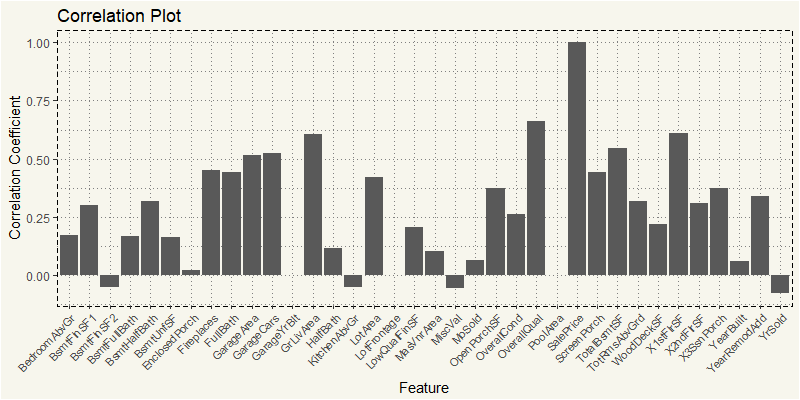
Yep, OverallQual and GrLivArea are the most positively correlated to the SalePrice. Let’s try RH.
|
1 2 3 4 5 6 7 8 9 10 11 12 13 14 15 16 17 18 19 20 21 |
EDA_RH <- train %>% filter(MSZoning == "RH") EDA_RH_N <- EDA_RH %>% select(4,5,18,19,20,21,27,35,37,38,39,44:53, 55,57,60,62,63,67:72,76,77,78,81) z_RH <- cor(EDA_RH_N) z_RH2 <- as.data.frame(z_RH[,36]) feature <- rownames(z_RH2) z_RH2 <- cbind(feature=feature,z_RH2) z_RH2$MSZoning <- "RH" names(z_RH2)[names(z_RH2)=="z_RH[, 36]"] <- "value" ggplot(z_RH2, aes(x=feature,y=value)) + geom_bar(stat="identity") + theme_moma() + xlab("Feature") + ylab("Correlation Coefficient") + ggtitle("Correlation Plot") + theme(axis.text.x = element_text(angle=45, hjust=1, size = 8)) |
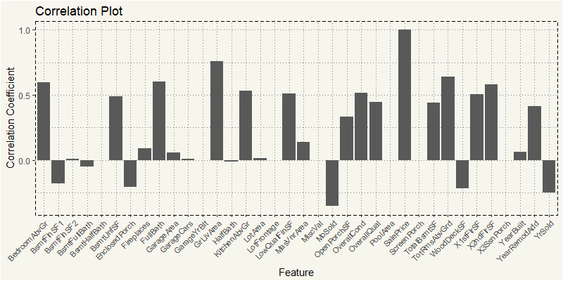
Those two are still the most correlated. But it seems like for high-density residential property purchasers; the living area is more important that overall quality of the house.
Let’s see what commercial estate purchasers think.
|
1 2 3 4 5 6 7 8 9 10 11 12 13 14 15 16 17 18 19 20 21 |
EDA_C <- train %>% filter(MSZoning == "C (all)") EDA_C_N <- EDA_C %>% select(4,5,18,19,20,21,27,35,37,38,39,44:53, 55,57,60,62,63,67:72,76,77,78,81) z_c <- cor(EDA_C_N) z_c2 <- as.data.frame(z_c[,36]) feature <- rownames(z_c2) z_c2 <- cbind(feature=feature,z_c2) z_c2$MSZoning <- "C (all)" names(z_c2)[names(z_c2)=="z_c[, 36]"] <- "value" ggplot(z_c2, aes(x=feature,y=value)) + geom_bar(stat="identity") + theme_moma() + xlab("Feature") + ylab("Correlation Coefficient") + ggtitle("C - Correlation Plot") + theme(axis.text.x = element_text(angle=45, hjust=1, size = 8)) |
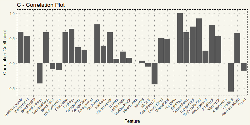
Oh, that’s interesting. The most positively correlated is TotRmsAbvGrd, which stands for Total Rooms Above Grade followed by usual GrLivArea and 1STFlrSF or First Floor square feet.
What about FV or Floating Village Residential?
|
1 2 3 4 5 6 7 8 9 10 11 12 13 14 15 16 17 18 19 20 21 |
EDA_FV <- train %>% filter(MSZoning == "FV") EDA_FV_N <- EDA_FV %>% select(4,5,18,19,20,21,27,35,37,38,39,44:53, 55,57,60,62,63,67:72,76,77,78,81) z_FV <- cor(EDA_FV_N) z_FV2 <- as.data.frame(z_FV[,36]) feature <- rownames(z_FV2) z_FV2 <- cbind(feature=feature,z_FV2) z_FV2$MSZoning <- "FV" names(z_FV2)[names(z_FV2)=="z_FV[, 36]"] <- "value" ggplot(z_FV2, aes(x=feature,y=value)) + geom_bar(stat="identity") + theme_moma() + xlab("Feature") + ylab("Correlation Coefficient") + ggtitle("FV - Correlation Plot") + theme(axis.text.x = element_text(angle=45, hjust=1, size = 8)) |
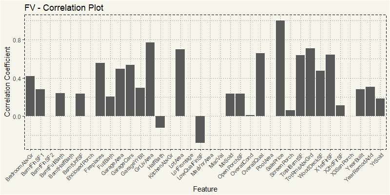
Yep, it is still the usual OverallQua and GrLiveArea.
I think we have uncovered different preferences among purchasers of different type of property. Let’s combine them all together for easy comparison.
|
1 2 3 4 5 6 7 8 9 10 |
compare_cor <- rbind(z_c2, z_FV2, z_RH2, z_rl2, z_RM2) compare_cor %>% filter(feature == "OverallQual" | feature == "GrLivArea" | feature == "TotRmsAbvGrd") %>% ggplot(aes(x = feature, y = value, fill = MSZoning)) + geom_bar(stat = "identity", position = "dodge") + theme_moma() + theme(legend.position = "bottom") |
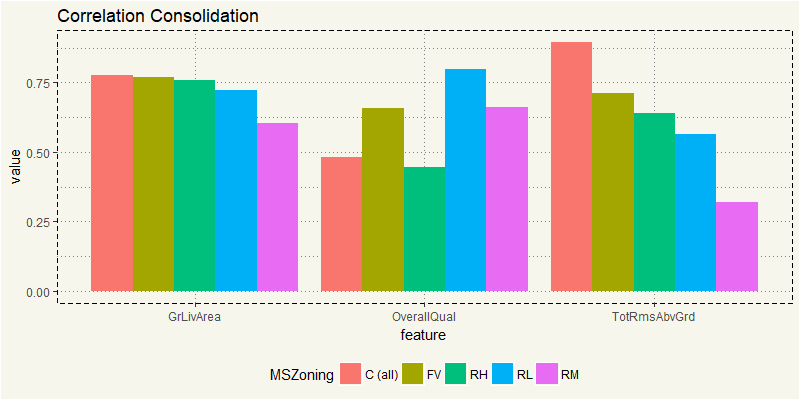
It is interesting to see that OverallQual is not the most correlated factor for commercial property. I’d guess for commercial property; space is the most important thing. After all, they purchase property to turn them into a money-making machine, right? So space is king.
Now, what about the entire dataset? My guess is it’s going to be close to what RL is as RL represents almost 80%.
|
1 2 3 4 5 6 7 8 9 10 11 12 13 14 15 16 17 |
train_num <- train %>% select(4,5,18,19,20,21,27,35,37,38,39,44:53, 55,57,60,62,63,67:72,76,77,78,81) Z_train <- cor(train_num) Z_train2 <- as.data.frame(Z_train[,36]) feature <- rownames(Z_train2) Z_train2 <- cbind(feature=feature,Z_train2) names(Z_train2)[names(Z_train2)=="Z_train[, 36]"] <- "value" ggplot(Z_train2, aes(x=feature,y=value)) + geom_bar(stat="identity") + theme_moma() + xlab("Feature") + ylab("Correlation Coefficient") + ggtitle("Train Data") + theme(axis.text.x = element_text(angle=45, hjust=1, size = 8)) |
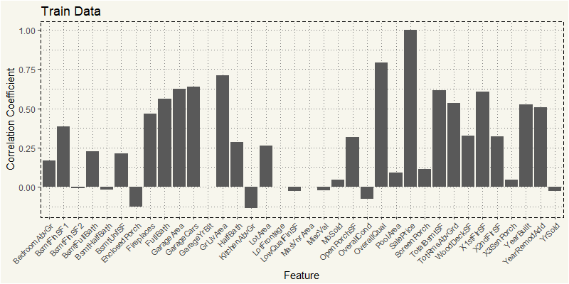
TL;DR; The preference of buyers differ by each type of zoning. Among numeric variables, RL MSZoning’s features mostly match to our common sense: newer YearBuilt, high OverQual, high LotArea correlated to higher price. But some MSZoning such as TotRmsAbvGrd, and 1STFlrSF are the most correlated. But as RL represents 78%, the entire train dataset is similar to that of RL.
