The data for this Exploratory Data Analysis (EDA) is published at Kaggle (link.) In this EDA, we will find where hospitals with high rating scores in the US are.
As usual, let’s load libraries and data.
|
1 2 3 4 5 6 7 8 |
##### Library ##### library(tidyverse) library(ggmap) library(gridExtra) library(ggcounty) library(stringr) data <- read.csv("C:/HospInfo.csv") |
There are many ways to plot the data on the map such as ggmap. Since the dataset doesn’t give longitude and latitude coordinates, I will utilize the ZIP code through a package called “ggcounty” from (link) and FIPS county code from U.S. Census. Next, we will set up some functions to use throughout the EDA.
|
1 2 3 4 5 6 7 8 9 10 11 12 13 14 15 16 |
##### Arrange Function ##### reorder <- function(x) { factor(x, levels = names(sort(table(x), decreasing = TRUE))) } ##### Theme Moma ##### theme_moma <- function(base_size = 12, base_family = "Helvetica") { theme( plot.background = element_rect(fill = "#F7F6ED"), legend.key = element_rect(fill = "#F7F6ED"), legend.background = element_rect(fill = "#F7F6ED"), panel.background = element_rect(fill = "#F7F6ED"), panel.border = element_rect(colour = "black", fill = NA, linetype = "dashed"), panel.grid.minor = element_line(colour = "#7F7F7F", linetype = "dotted"), panel.grid.major = element_line(colour = "#7F7F7F", linetype = "dotted") ) } |
Next, let’s process data.
|
1 2 3 4 5 6 7 8 9 10 11 |
##### Data Processing ##### #Tbl_ df data <- tbl_df(data) #Initialize Zipcode data(zipcode) zipcode <- tbl_df(zipcode) #Clean Zip Code data$ZIP.Code <- clean.zipcodes(data$ZIP.Code) #Correct those with leading 0 data <- rename(data, zip = ZIP.Code) #Rename for joining |
As usual, let’s start with glimpse() .
|
1 |
glimpse(data) |
|
1 2 3 4 5 |
Observations: 4,807 Variables: 29 $ Provider.ID <int> 10001, 10005, 10006, 10007, 10008, 10011, 10012, 1001... $ Hospital.Name <fctr> SOUTHEAST ALABAMA MEDICAL CENTER, MARSHALL MEDICAL C... $ Address <fctr> 1108 ROSS CLARK CIRCLE, 2505 U S HIGHWAY 431 NORTH, ... |
There are 4,807 observations and 29 variables. Many of them are factors that are not yet sorted. Also, they use “Not Available.” So, I will sort the level of factor and change “Not Available” to NA.
|
1 2 3 4 5 6 7 8 9 10 11 12 13 14 15 16 17 18 19 20 21 22 23 24 25 26 27 28 29 30 31 32 33 34 35 36 37 38 39 40 41 42 |
#Change "Not Applicable" to true NA data[data == "Not Available"] = NA #Changing Order data$Mortality.national.comparison <- ordered( data$Mortality.national.comparison, levels = c("Above the National average", "Same as the National average", "Below the National average")) data$Safety.of.care.national.comparison <- ordered( data$Safety.of.care.national.comparison, levels = c("Above the National average", "Same as the National average", "Below the National average")) data$Readmission.national.comparison <- ordered( data$Readmission.national.comparison, levels = c("Above the National average", "Same as the National average", "Below the National average")) data$Patient.experience.national.comparison <- ordered( data$Patient.experience.national.comparison, levels = c("Above the National average", "Same as the National average", "Below the National average")) data$Effectiveness.of.care.national.comparison <- ordered( data$Effectiveness.of.care.national.comparison, levels = c("Above the National average", "Same as the National average", "Below the National average")) data$Timeliness.of.care.national.comparison <- ordered( data$Timeliness.of.care.national.comparison, levels = c("Above the National average", "Same as the National average", "Below the National average")) data$Efficient.use.of.medical.imaging.national.comparison <- ordered( data$Efficient.use.of.medical.imaging.national.comparison, levels = c("Above the National average", "Same as the National average", "Below the National average")) #Joining Lat Long eda <- left_join(data, zipcode, by = "zip") #Join Lat and Lon eda <- select(eda, -city, -state, -Location) #Delete city and states |
From now on we will call the dataset “eda.” There are 4807 observations (or hospitals) in the dataset covering 53 states. There are many exciting features such as “Hospital Overall Rating,” “Readmission.national.comparison”, and other types of comparison. For a start, I’d like to focus on the overall quality of the hospital. So, let’s see how the score distributed.
|
1 2 3 4 5 6 |
##### Rating ##### ggplot(eda, aes(x = Hospital.overall.rating)) + geom_bar(alpha = 0.6) + ggtitle("Rating Distribution") + theme_moma() + xlab("Overall Rating") + ylab("Count") |
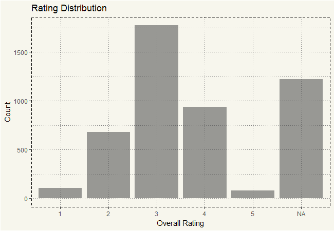
Ah, isn’t that a normally distributed chart?! Excluding “NA” of course. But that’s a whole lot of NA. Isn’t that about 25% of the data? 😐 Next, let’s see how many states are in this dataset.
|
1 2 3 4 5 6 7 8 |
##### States ##### ggplot(eda, aes(x = reorder(State))) + geom_bar(alpha=0.6) + ylim(0,425) + ggtitle("No. of Hospitals by State") + theme_moma() + theme(axis.text.x = element_text(angle=45, hjust=1, size = 8)) + xlab("States") + ylab("Count") |
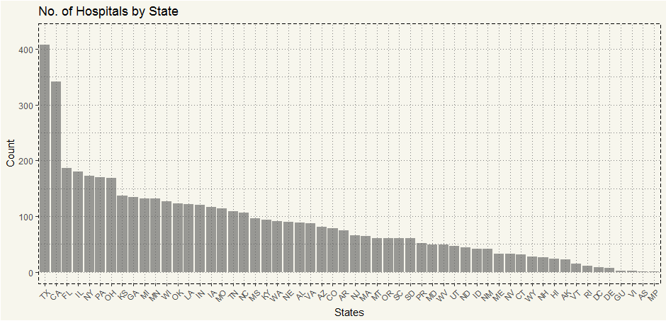
Texas has a whole lot of representation in this dataset. But since we have over 25% of NA, I think it is worthwhile to see what it looks like.
|
1 2 3 4 5 6 7 8 9 |
##### NA Count by State ##### eda %>% mutate(Type = ifelse(is.na(Hospital.overall.rating) == FALSE, "Not NA", "NA"))%>% ggplot(aes(x = reorder(State), fill = Type)) + geom_bar(alpha = 0.6) + ggtitle("NA Count by State") + theme_moma() + theme(axis.text.x = element_text(angle=45, hjust=1, size = 8), legend.position = "bottom") + xlab("States") + ylab("Count") |

As expected, a whole lot of hospitals in Texas cannot report the data. But some states such as Puerto Rico and South Dakota have more than 70% hospitals that cannot complete the survey. Is there any state that worse than that? Yes, Maryland. It seems like ALL hospitals in Maryland cannot out the data. I’m curious why.
|
1 2 3 4 5 6 7 8 9 |
##### Why Cannot They Report? ##### eda %>% filter(is.na(Hospital.overall.rating) == TRUE) %>% ggplot(aes(x = reorder(Hospital.overall.rating.footnote))) + geom_bar(alpha=0.6) + scale_x_discrete(labels = function(x) str_wrap(x, width = 20)) + xlab("Reasons") + ylab("Count") + ggtitle("Why Cannot They Report?") + theme_moma() |

Hm, so I would guess the majority of the hospitals that cannot report scores are relatively small hospitals? Let’s drill deeper, the “Hospital.Ownership” variable may shed some light.
|
1 2 3 4 5 6 7 8 9 10 |
##### The Owners of Non-Compliance ##### eda %>% filter(is.na(Hospital.overall.rating) == TRUE) %>% ggplot(aes(fill = Hospital.Type, x = reorder(Hospital.Ownership))) + geom_bar(alpha=0.6) + scale_x_discrete(labels = function(x) str_wrap(x, width = 20)) + xlab("Ownership") + ylab("Count") + ggtitle("Ownership") + theme(axis.text.x = element_text(angle=45, hjust=1, size = 10), legend.position = "bottom") + theme_moma() |
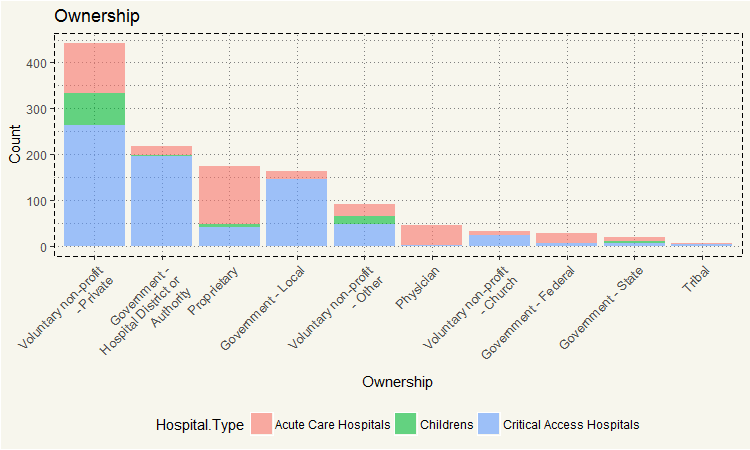
Voluntary non-profit – Private could not do the reporting. I’d guess they are somehow a small hospital that may not offer that many services and thus just simply too few measures.
For now, let’s include those that cannot report out and make some charts.
There are eight scoring features in the dataset as follows:
- Hospital overall rating
- Mortality.national.comparison
- Safety.of.care.national.comparison
- Readmission.national.comparison
- Patient.experience.national.comparison
- Effectiveness.of.care.national.comparison
- Timeliness.of.care.national.comparison
- Efficient.use.of.medical.imaging.national.comparison
The most interesting feature is, of course, overall rating. I’d rather think that those score five would probably have “Above.Average” in other features. But we would never know until we take a look.
|
1 2 3 4 5 6 7 8 9 10 11 12 13 14 15 16 17 18 19 |
##### Comparison ##### c1 <- ggplot(eda, aes(y = Hospital.overall.rating, x = Mortality.national.comparison)) + geom_jitter(aes(colour = "red"),alpha=0.2) + scale_x_discrete(labels = function(x) str_wrap(x, width = 20)) + theme_moma() + theme(legend.position = "none",axis.text.x = element_text(size = 7)) c2 <- ggplot(eda, aes(y = Hospital.overall.rating, x = Safety.of.care.national.comparison)) + geom_jitter(aes(colour = "red"),alpha=0.2) + scale_x_discrete(labels = function(x) str_wrap(x, width = 20)) + ylab("") +theme_moma() + theme(legend.position = "none",axis.text.x = element_text(size = 7)) c3 <- ggplot(eda, aes(y = Hospital.overall.rating, x = Readmission.national.comparison)) + geom_jitter(aes(colour = "red"),alpha=0.2) + scale_x_discrete(labels = function(x) str_wrap(x, width = 20)) + theme_moma() + theme(legend.position = "none",axis.text.x = element_text(size = 7)) c4 <- ggplot(eda, aes(y = Hospital.overall.rating, x = Patient.experience.national.comparison)) + geom_jitter(aes(colour = "red"),alpha=0.2) + scale_x_discrete(labels = function(x) str_wrap(x, width = 20)) + ylab("") + theme_moma() + theme(legend.position = "none",axis.text.x = element_text(size = 7)) grid.arrange(c1,c2,c3,c4, nrow = 2, ncol = 2) |
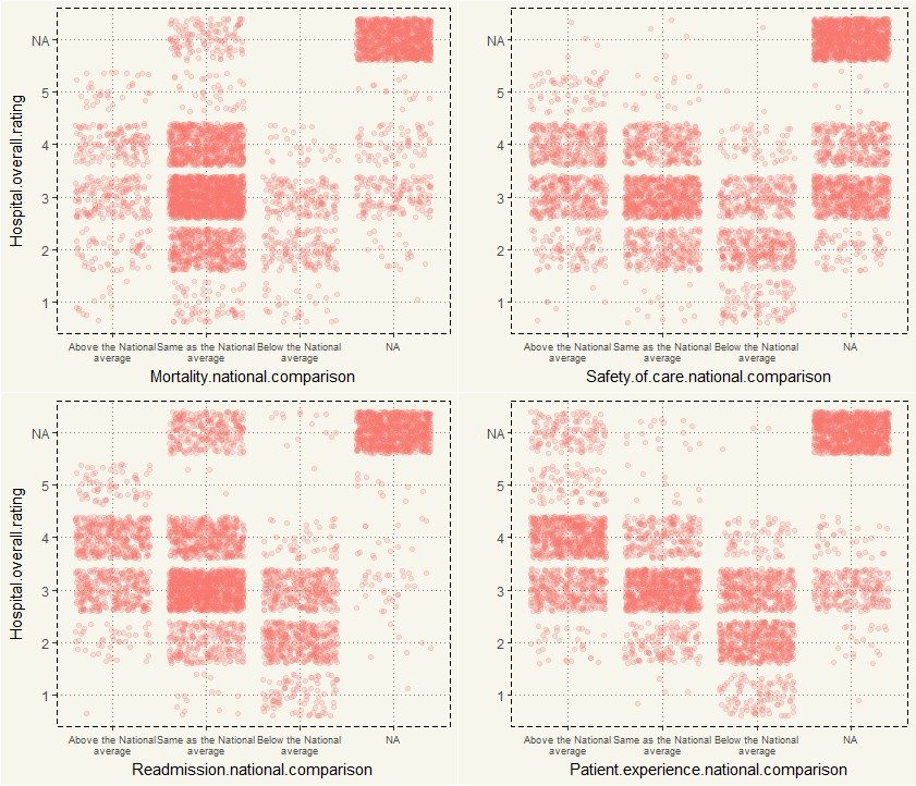
Yes, as expected, if a hospital gets a 5 rating, they would generally score either Above or Same. But come to think about it, two charts are interesting: Mortality and Readmission. In other features, “Above” is better than “Below.” But those 2 are the opposite. However, those with five stars mostly fall into “Above.” Hm, so the case is either miscoding or 5-star hospital does, in fact, have more readmission rate.
It is certainly good to know about the quality of the hospital. But bar chart or scatter plot may not be the most appropriate chart in this case. Let’s try choropleth. But I am not certain if we should use “Hospital.overall.rating” since they have over 25% of missing data in the feature. Fortunately, “Hospital.overall.rating” is not the only measure available in this dataset. Some interesting features of this dataset are that a hospital can still report out some other measures even though they don’t have the score for “Hospital.overall.rating.” Let’s take a look.
|
1 2 3 4 |
eda %>% filter(is.na(Hospital.overall.rating) == TRUE) %>% group_by(Mortality.national.comparison) %>% tally() |
|
1 2 3 4 5 |
# A tibble: 2 × 2 Mortality.national.comparison n <ord> <int> 1 Same as the National average 128 2 NA 1095 |
128 Hospitals could report the “Mortality.national.comparison” measure. Well, they could report something. 🙂 So, I’ll create a new criterion. I will give the score of 3 to “Above the national average,” 2 to “Same as the National average” and 1 to “Below the National average.” I’ll reverse the score for Readmission and Mortality rate as “Above average” indicates the worse condition.
|
1 2 3 4 5 6 7 8 9 10 11 12 13 14 15 16 17 18 19 20 21 22 23 24 25 26 27 28 29 30 31 32 33 34 |
##### Scoring System ##### #I'd propose a new aggregated way for scoring. It is.... eda2 <- eda %>% mutate(Readmission.Score = ifelse(Readmission.national.comparison == "Above the National average", 1, ifelse(Readmission.national.comparison == "Same as the National average", 2, ifelse(Readmission.national.comparison == "Below the National average", 3,0)))) %>% mutate(Mortality.Score = ifelse(Mortality.national.comparison == "Above the National average", 1, ifelse(Mortality.national.comparison == "Same as the National average", 2, ifelse(Mortality.national.comparison == "Below the National average", 3,0)))) %>% mutate(Safety.Score = ifelse(Safety.of.care.national.comparison == "Above the National average", 3, ifelse(Safety.of.care.national.comparison == "Same as the National average", 2, ifelse(Safety.of.care.national.comparison == "Below the National average", 1,0)))) %>% mutate(Pat.x.Score = ifelse(Patient.experience.national.comparison == "Above the National average", 3, ifelse(Patient.experience.national.comparison == "Same as the National average", 2, ifelse(Patient.experience.national.comparison == "Below the National average", 1,0)))) %>% mutate(Effectiveness.Score = ifelse(Effectiveness.of.care.national.comparison == "Above the National average", 3, ifelse(Effectiveness.of.care.national.comparison == "Same as the National average", 2, ifelse(Effectiveness.of.care.national.comparison == "Below the National average", 1,0)))) %>% mutate(Time.Score = ifelse(Timeliness.of.care.national.comparison == "Above the National average", 3, ifelse(Timeliness.of.care.national.comparison == "Same as the National average", 2, ifelse(Timeliness.of.care.national.comparison == "Below the National average", 1,0)))) %>% mutate(Imaging.Score = ifelse(Efficient.use.of.medical.imaging.national.comparison == "Above the National average", 3, ifelse(Efficient.use.of.medical.imaging.national.comparison == "Same as the National average", 2, ifelse(Efficient.use.of.medical.imaging.national.comparison == "Below the National average", 1,0)))) %>% mutate(Overall.Score = as.numeric(Hospital.overall.rating)) %>% rowwise() %>% mutate(sum = sum(Readmission.Score, Mortality.Score, Safety.Score, Pat.x.Score, Effectiveness.Score, Time.Score, Imaging.Score, Overall.Score, na.rm = TRUE)) |
Let’s see the new score.
|
1 2 3 4 5 6 |
##### New Score ##### ggplot(eda2, aes(x=sum)) + geom_bar() + ggtitle("New Scoring's Distribution") + xlab("Sum") + ylab("Count") + theme_moma() |
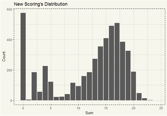
Well, at least we decreased the NA by half! 😀 Those with a score of zero are hospitals that truly cannot report anything out. Alright, now is the time to do the choropleth map. The data gives the ZIP code which will be handy when combining with the FIPS data. Let’s download the FIPS from census.gov.
|
1 2 3 4 5 6 7 8 9 |
##### EXTRACTING FIPS ##### #Download FIPS File FIPS <- read_csv("http://www2.census.gov/geo/docs/reference/codes/files/national_county.txt", col_names = FALSE, col_types = cols(X1 = col_character(), X2 = col_character(), X3 = col_character(), X4 = col_character(), X5 = col_skip())) |
Unfortunately, there are a whole lot of preparation we need to do before joining them together; some is more annoying than others. There are some differences in little details on how to spell county names: LASALLE or LA SALLE, ST. MART’s or ST. MARY. All of those small differences must be fixed.
|
1 2 3 4 5 6 7 8 9 10 11 12 13 14 15 16 17 18 19 20 21 22 23 24 25 26 27 28 29 30 31 32 33 34 35 |
#Change to Uppercase FIPS$X4 <- toupper(FIPS$X4) #Get Rid of "County" FIPS$X4 <- str_replace(FIPS$X4, " COUNTY", "") #Take care of LA "Parish" FIPS$X4 <- str_replace(FIPS$X4, " PARISH", "") #Miscellaneous FIPS$X4 <- str_replace(FIPS$X4, "O'BRIEN", "OBRIEN") FIPS$X4 <- str_replace(FIPS$X4, "LASALLE", "LA SALLE") FIPS$X4 <- str_replace(FIPS$X4, "LAPORTE", "LA PORTE") FIPS$X4 <- str_replace(FIPS$X4, "PRINCE GEORGE'S", "PRINCE GEORGES") FIPS$X4 <- str_replace(FIPS$X4, "ST. MARY'S", "ST. MARYS") FIPS$X4 <- str_replace(FIPS$X4, "STE. GENEVIEVE", "SAINTE GENEVIEVE") FIPS$X4 <- str_replace(FIPS$X4, "SALEM CITY", "SALEM") #Concat FIPS Location FIPS <- mutate(FIPS, Location = paste(X2,X3,sep="")) #Concat CountyState FIPS <- mutate(FIPS, CountyState= paste(X4,X1,sep=",")) ##### Extracting Test Dataframe##### eda2 <- eda2 %>% mutate(CountyState = paste(County.Name,State, sep = ",")) %>% group_by(CountyState) %>% mutate(mean_sum = round(mean(sum), digits = 0)) %>% mutate(mean_overall = round(mean(Overall.Score, na.rm=TRUE), digits = 1)) #Replace SAINT with "St. " eda2$CountyState <- str_replace(eda2$CountyState, "SAINT ", "ST. ") eda2$CountyState <- str_replace(eda2$CountyState, "DE KALB", "DEKALB") eda2$CountyState <- str_replace(eda2$CountyState, "ST JOSEPH", "ST. JOSEPH") |
And now is the time for joining FIPS and the hospital data.
|
1 2 |
##### Left Join ##### eda2 <- left_join(eda2, FIPS, by ="CountyState") |
Next, we will create a base map by using “ggcounty” package.
|
1 2 3 |
##### Creating Maps ##### us <- ggcounty.us() gg <- us$g |
Now the map is ready. Let’s plot the hospital data on the map.
|
1 2 3 4 5 |
gg + geom_map(data=eda2, map=us$map, aes(map_id=Location, fill = mean_sum), color="white", size=0.125) + theme(legend.position = "bottom") + theme_moma() |

Hm, that’s interesting. Those white counties are counties that are not in the survey. I am not quite surprised that counties with white or dark blue are in the Midwest. But it seems like hospital qualities in the West Coast (California, Portland, and Washington) are on the lower end comparing to those in the East. Let’s take a look at California in particular.
|
1 2 3 4 5 6 7 8 9 10 11 |
##### California ##### California <- ggcounty("California") CA <- California$gg CA_State <- eda2 %>% filter(State == "CA") CA + geom_map(data=CA_State, map=us$map, aes(map_id=Location, fill = mean_sum), color="white", size=0.125) + geom_jitter(data=CA_State, aes(y=latitude, x=longitude, col = mean_sum)) + theme(legend.position = "bottom") + theme_moma() |

It is quite on the lighter blue. But what is wrong with those two counties? They are huge yet have a low score. Let’s plot hospitals in the map.
|
1 2 3 4 5 6 7 |
CA + geom_map(data=CA_State, map=us$map, aes(map_id=Location, fill = mean_sum), color="white", size=0.125) + geom_jitter(data=CA_State, aes(y=latitude, x=longitude, col = mean_sum)) + scale_colour_gradientn(colors=terrain.colors(10),guide_legend(title = "Hospital Score")) + theme(legend.position = "bottom") + theme_moma() |
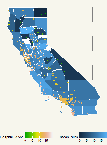
Hm, apparently, there are a lot of hospitals in San Francisco, Los Angeles, and San Diego. The counties in question though have either 1 or 2 hospitals in the survey. I’d think they must be small hospitals that may not have the capacity to track all the kinds of stuff in the questionnaire.
Let’s see if the assumption is correct with a state that could have a huge amount of hospitals but clustered only to a couple of counties… New York!
|
1 2 3 4 5 6 7 8 9 10 11 12 13 |
##### New York ##### NewYork <- ggcounty("New York") NY<- NewYork$gg NY_State <- eda2 %>% filter(State == "NY") NY + geom_map(data=NY_State, map=us$map, aes(map_id=Location, fill = mean_sum), color="white", size=0.125) + geom_jitter(data=NY_State, aes(y=latitude, x=longitude, col = mean_sum)) + scale_colour_gradientn(colors=terrain.colors(10),guide_legend(title = "Hospital Score")) + theme(legend.position = "bottom") + theme_moma() |
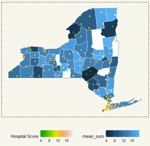
Some counties have a really high score, but that was just from a couple of hospitals. On the contrary, New York City score should be around in the middle where there are significantly more hospitals in the area.
I think that makes sense. There are 8 million people in NYC and to take good care of all of them is just simply impossible. On the contrary, in a small county where a population is not so high, healthcare management would be much easier and thus result in a higher score.
I think this is a pretty good dataset to give the overall state of the healthcare in the US. But I feel like the reach of this survey is somewhat limited. There must be some criteria that will dictate if a hospital will be included. So if you were to move to a rural area, this dataset might not help you out that much as hospitals in the area may not even be in this dataset. But if you move to a big city such as New York City, Los Angeles, or San Francisco, this dataset can really help you figure out what hospital you should go. And to answer the question above, I’d say this chart can help.
|
1 2 3 4 5 |
###### Best Hospitals ##### ggplot(eda2, aes(x=State,y=sum)) + geom_boxplot(fill = "#F7F6ED") + theme_moma() + theme(axis.text.x = element_text(angle=45, hjust=1, size = 7), legend.position = "bottom") |

Hm, so, It seems like Indiana has the highest score hospital in the dataset. Also, its overall hospitals appear to have a score of more than 15. Delaware and Rhode Island have good overall scores. Yep, those are all rural states, while highly populated states such as California and New York have very broad score distribution.
TL;DR: I think this is a good dataset yet incomplete. It can act as a good indicator but with some grain of salt. First, it certainly cannot cover every hospital in the US. Second, some small hospitals seem to struggle with answering the surveys. Third, for some reason, some states such as Maryland cannot answer any of the questions. 😐
