Please refer to this post for scraping code. As usual, we need to load the goodies.
|
1 2 3 4 5 6 7 |
##### Load Goodies ##### library(tidyverse) library(tidytext) library(stringi) library(stringr) library(ggraph) library(igraph) |
First, we will remove the initial row. Next, we need to clean up the Posted_Date. One funny thing about the Posted_Date is that the first 300 observations, the format is DDMMMYYYY. But from 301 on, the format is MMMDDYYYY. Therefore we need two separate date conversion codes for them.
|
1 2 3 4 5 6 7 8 9 10 11 12 13 |
##### Remove First Row ##### data <- data %>% filter(Summary != "xx") ##### Change Date Format ##### temp_1 <- data[1:300,] temp_2 <- data[301:6410,] temp_1$Posted_Date <- as.Date(temp_1$Posted_Date, format = "%d %b, %Y") temp_2$Posted_Date <- as.Date(temp_2$Posted_Date, format = " %b %d, %Y") data2 <- rbind(temp_1,temp_2) rm(temp_1,temp_2) |
Next, we need to clean up the Title. The original Title comes in the form of “Employee Status – Title in Location.” The original form looks more like a combination of three variables. We need to do some data munging.
|
1 2 3 4 5 |
##### Munging with the Words ##### #Separating Employee Type and Locations data2 <- data2 %>% separate(col = Title, into = c("Employee_Type","Location"),sep = ' in ') %>% separate(col = Employee_Type, into = c("Employee_Type", "Title"), sep = 'ee - ') |
I used “ee -” instead of just an “-” because some users used “-” to indicate the job level. So we need to add an extra step in the process.
|
1 |
data2$Employee_Type <- str_replace_all(data2$Employee_Type, "Employ","Employee") |
Let’s see the columns we have
|
1 |
names(data2) |
|
1 2 3 |
> names(data2) [1] "Posted_Date" "Summary" "Pros" "Cons" "Employee_Type" "Title" [7] "Location" |
Okay. That is much better. Now is the time to process the comments. As I want to see how the string operations affect the data, I’ll create new columns.
|
1 2 3 4 5 |
##### Creating New Variables for Munging ##### data2<- data2 %>% mutate(Summary_2 = Summary, Pros_2 = Pros, Cons_2 = Cons) |
In writings, capitalization matters. But it is not in this case.
|
1 2 3 4 |
##### Change to lower case##### data2$Summary_2 <- str_replace_all(data2$Summary_2, "[:alpha:]",tolower) data2$Pros_2 <- str_replace_all(data2$Pros_2, "[:alpha:]",tolower) data2$Cons_2 <- str_replace_all(data2$Cons_2, "[:alpha:]",tolower) |
After glancing the data, I found that users called companies and CEO in different ways. I’ll just change them to ‘company’ and ‘ceo.’
|
1 2 3 4 5 6 7 8 9 10 11 12 13 14 15 16 17 18 19 20 21 |
##### Company Name ##### name <- array(c("msft", "microsoft")) for (i in 1:nrow(name)){ print(i) for (j in 8:ncol(data2)) { data2[[j]] <- str_replace_all(data2[[j]],name[[i]],"company") print(j) } } ##### CEO Name ##### ceo <- array(c("satya", "nadella", "satya nadella")) for (i in 1:nrow(ceo)){ print(i) for (j in 8:ncol(data2)) { data2[[j]] <- str_replace_all(data2[[j]],ceo[[i]],"ceo") print(j) } } |
Another word that needs some fix is “work-life balance.” There are seven major variations. We need to make them aligned.
|
1 2 3 4 5 6 7 8 9 10 11 |
##### Work Life Balance ##### worklife <- array(c("work life balance", "work-life balance", "work/life balance", "work life", "work&life", "worklife")) for (i in 1:nrow(worklife)){ print(i) for (j in 8:ncol(data2)) { data2[[j]] <- str_replace_all(data2[[j]],worklife[[i]],"wlb") } } |
Finally, removing punctuation and numbers.
|
1 2 3 4 5 6 7 8 |
##### Remove Punctuations and Numbers ##### data2$Summary_2 <- str_replace_all(data2$Summary_2, "[:punct:]","") data2$Pros_2 <- str_replace_all(data2$Pros_2, "[:punct:]","") data2$Cons_2 <- str_replace_all(data2$Cons_2, "[:punct:]","") data2$Summary_2 <- str_replace_all(data2$Summary_2, "[:digit:]","") data2$Pros_2 <- str_replace_all(data2$Pros_2, "[:digit:]","") data2$Cons_2 <- str_replace_all(data2$Cons_2, "[:digit:]","") |
At this point, there are too many unique titles. I’ll use ifelse() to group them.
|
1 2 3 4 5 6 7 8 9 10 11 12 13 14 15 16 17 |
##### Creating Group ##### data2 <- data2 %>% mutate(Group = ifelse(str_detect(Title,"Data Scientist")==TRUE | str_detect(Title,"Data Analyst")==TRUE, "Data Science", ifelse(str_detect(Title,"Engineer")==TRUE, "Engineering", ifelse(str_detect(Title,"SDE")==TRUE, "Engineering", ifelse(str_detect(Title,"Finance")==TRUE,"Finance", ifelse(str_detect(Title,"Financial")==TRUE,"Finance", ifelse(str_detect(Title,"Product")==TRUE,"Product Management", ifelse(str_detect(Title,"Human")==TRUE | str_detect(Title,"Staffing")==TRUE,"Human Resources", ifelse(str_detect(Title,"Marketing")==TRUE,"Marketing", ifelse(str_detect(Title,"Anonymous")==TRUE,"Anonymous", ifelse(str_detect(Title,"Program Manager")==TRUE,"Program Management", ifelse(str_detect(Title,"Director")==TRUE,"Director", ifelse(str_detect(Title,"Intern")==TRUE,"Intern", "Miscellaneous"))))))))))))) |
Before we proceed to text analytics, let’s do an EDA.
|
1 2 3 4 5 6 7 8 9 10 11 12 13 14 |
##### Themes ##### theme_moma <- function(base_size = 12, base_family = "Helvetica") { theme( plot.background = element_rect(fill = "#F7F6ED"), legend.key = element_rect(fill = "#F7F6ED"), legend.background = element_rect(fill = "#F7F6ED"), panel.background = element_rect(fill = "#F7F6ED"), panel.border = element_rect(colour = "black", fill = NA, linetype = "dashed"), panel.grid.minor = element_line(colour = "#7F7F7F", linetype = "dotted"), panel.grid.major = element_line(colour = "#7F7F7F", linetype = "dotted") ) } arrow_control <- grid::arrow(type = "closed", length = unit(.15, "inches")) |
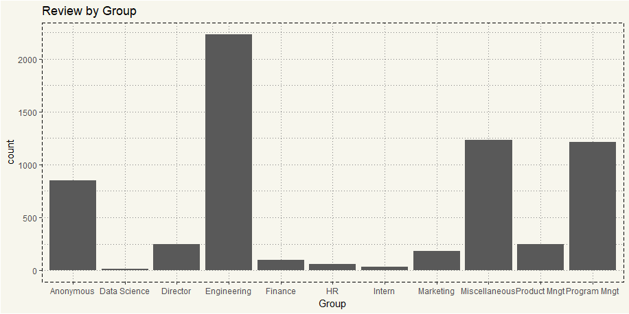
So, what group do most of our reviewers work for?
|
1 2 3 4 5 |
##### Group Counts ##### ggplot(data2, aes(x=Group)) + geom_bar() + theme_moma() + ggtitle("Review by Group") |

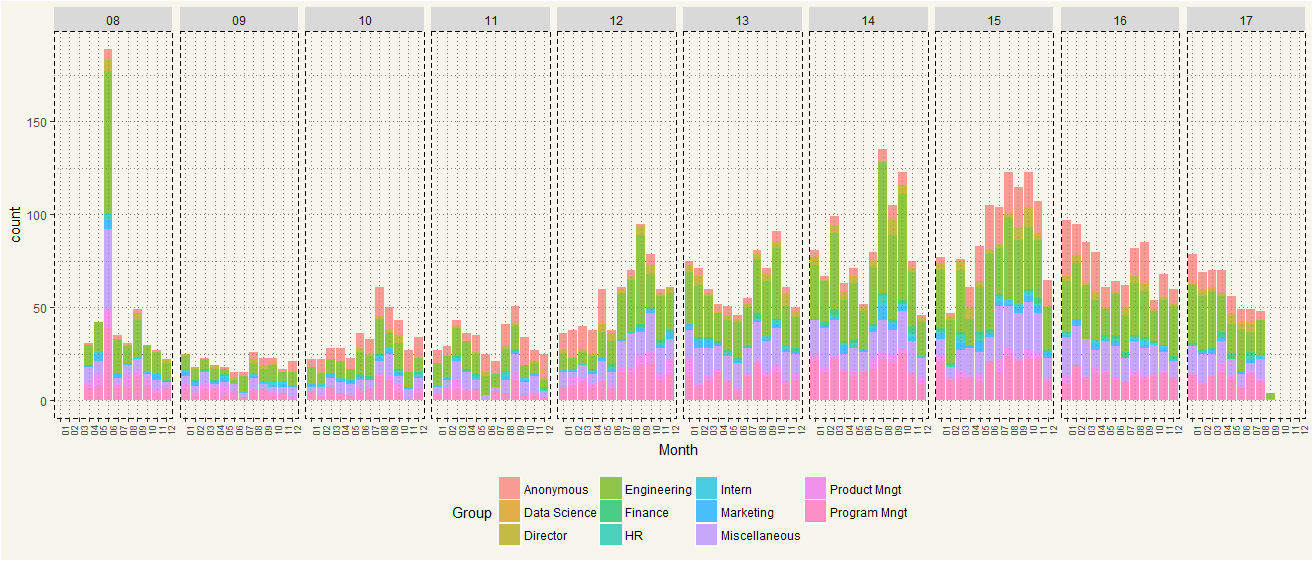
No doubt as Microsoft is an engineering-intensive company. Now let’s see the time-series plot.
|
1 2 3 4 5 6 7 8 9 10 11 |
data2 %>% select(Posted_Date, Group) %>% arrange(Posted_Date) %>% mutate(Month = format(Posted_Date, "%m")) %>% mutate(Year = format(Posted_Date, "%y")) %>% select(Month, Group, Year) %>% ggplot(aes(x = Month, fill = Group)) + geom_bar(stat = 'count', alpha =0.7) + theme_moma() + theme(legend.position = "bottom", axis.text.x = element_text(angle = 90, size = 7)) + facet_grid(.~Year) |

It seems like the Glassdoor popularity among Microsoft employees gained traction over time. But popularity started to dwindle in the past two years. In term of Group, users certainly have opted more anonymity. Also, Program Management group has participated more since 2012.
Next, let’s take a look at the Pros and Cons. Instead of using Word Cloud that brings the most common word, I’ll create a network diagram for bigram.
First, we create an ngram for Pros_2.
|
1 2 3 4 5 |
#Step 1: Create ngram data_pros <- data2 %>% select(Pros_2) %>% unnest_tokens(words, Pros_2, token = 'ngrams',n = 2) data_pros |
|
1 2 3 4 5 6 7 8 9 10 11 12 13 14 |
A tibble: 172,848 x 1 words <chr> 1 good wlb 2 wlb good 3 good benefits 4 benefits great 5 great compensation 6 compensation and 7 and benefitsgreat 8 benefitsgreat opportunities 9 opportunities for 10 for vertical # ... with 172,838 more rows |
unnest_tokens() will pair 2 words together as 1 observation. Then we will split them into ‘from’ and ‘to.’
|
1 2 3 4 5 6 |
#Step 2: Separate data_pros_split <- data_pros %>% separate(words, c("from","to",sep = " ")) %>% select(1:3) data_pros_split |
|
1 2 3 4 5 6 7 8 9 10 11 12 13 14 15 |
> data_pros_split # A tibble: 172,848 x 2 from to * <chr> <chr> 1 good wlb 2 wlb good 3 good benefits 4 benefits great 5 great compensation 6 compensation and 7 and benefitsgreat 8 benefitsgreat opportunities 9 opportunities for 10 for vertical # ... with 172,838 more rows |
Now we’ve got two columns. However, there are stop words. Tidytext has built-in stop words data, which we can use to filter out.
|
1 2 3 4 |
#Step 3: Remove stopwords data_pros_clean <- data_pros_split %>% filter(!from %in% stop_words$word) %>% filter(!to %in% stop_words$word) |
Next, we count the occurrence of each bigram, which will be used to differentiation later in the network graph.
|
1 2 3 4 5 |
#Step 4: Count data_pros_counts <- data_pros_clean %>% count(from, to) data_pros_counts |
|
1 2 3 4 5 6 7 8 9 10 11 12 13 14 15 |
> data_pros_counts # A tibble: 18,853 x 3 from to n <chr> <chr> <int> 1 ability create 1 2 abound constantly 1 3 abroad decent 1 4 absentthe trio 1 5 absolutely believes 1 6 absolutely constant 1 7 absolutely fantastic 1 8 absolutely gorgeous 1 9 absolutely stunned 1 10 abstract research 1 # ... with 18,843 more rows |
Alright, we are now ready to create a network diagram. Since it is likely that plotting every occurrence will significantly clutter the Plot area, let’s specify the minimum occurrence at 30.

So… I expected compensation to be the most frequent term. It turned out, people at Microsoft seem to appreciate each other intelligence the most. Then it is the benefits, pays, and career growth.
Let’s repeat the same process with Cons by just changing ‘Pros’ in the first step to ‘Cons.’

Ok… politics, stack ranking, and review system, which is quite typical for a gigantic company. So… it seems like rank-and-file employees don’t really like their bosses. Both middle managers and upper managers are mentioned in the Cons section.
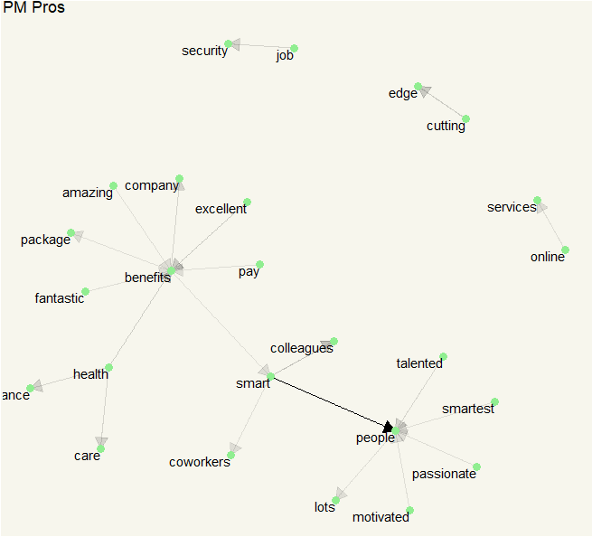
Although we got pretty interesting Pros and Cons, the data itself disproportionately represented by Engineering group. It is possible that the most of the bigram is from Engineering. Let’s take a look at Product Management group.
The process is still the same, all we need to do is to use filter (Group == “Product Mngt”) in the first step.

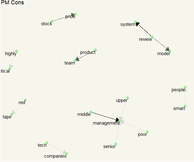
Okay. It is still about the same Pros: smart people, health insurance, and great benefits. What about Cons?

TL;DR Although comments in Glassdoor are subjective to users; they are still better than knowing nothing at all about a company.
