In this tutorial, I’ll show you how to use the kNN (k – nearest neighbor) algorithm in R. kNN is considered Supervised Machine Learning as we already know what the result of the algorithm should be (aka it’s pre-labeled.)
So, as usual, let’s load the packages.
|
1 2 3 4 5 |
#####Load Packages ##### library(class) library(ggplot2) library(dplyr) library(gridExtra) |
We will use ggplot2 for visualization, Dplyr for general data manipulation, gridExtra for arranging plots, and Class for kNN. Next, I’ll create a theme for visualization.
|
1 2 3 4 5 6 7 8 9 10 11 12 |
##### Theme Moma ##### theme_moma <- function(base_size = 12, base_family = "Helvetica") { theme( plot.background = element_rect(fill = "#F7F6ED"), legend.key = element_rect(fill = "#F7F6ED"), legend.background = element_rect(fill = "#F7F6ED"), panel.background = element_rect(fill = "#F7F6ED"), panel.border = element_rect(colour = "black", fill = NA, linetype = "dashed"), panel.grid.minor = element_line(colour = "#7F7F7F", linetype = "dotted"), panel.grid.major = element_line(colour = "#7F7F7F", linetype = "dotted") ) } |
Finally, let’s load the data
|
1 2 |
##### Load Data ##### paintings <- read.csv("C:/Users/Data.csv") |
I have created a bogus dataset of 100 paintings. We will use kNN() to predict the painter of a test set. We will not convert the “paintings” data to Tibble format as knn() cannot work with Tibble.
Let’s take a look at the data
|
1 2 |
##### Glimpse ##### glimpse(paintings) |
|
1 2 3 4 5 6 |
Observations: 100 Variables: 4 $ Number.of.Jewels <int> 1, 3, 6, 2, 2, 3, 4, 5, 2, 3, 2, 4, 2, 5, 1, 4, 6, 2, 6, 2,... $ Shades.of.Blue <dbl> 2.2, 1.1, 2.7, 4.6, 3.9, 1.7, 2.0, 2.4, 3.1, 4.3, 4.2, 3.2,... $ Painter <fctr> DaVinci, DaVinci, DaVinci, DaVinci, DaVinci, DaVinci, DaVi... $ Painting.Name <fctr> A, B, C, D, E, F, G, H, I, J, K, L, M, N, O, P, Q, R, S, T... |
The data is a made up dataset comparing 100 paintings from 4 artists (Davinci, Munch, Picasso, and Rembrandt.) I used the “Number of Jewels” appear in a painting and shades of blue on the scale of 1 to 10, where the higher the number indicates the darker shade of blue as predictors.
Before we dive into the data, I’d like to discuss kNN first. So, what is kNN?
In short, kNN can be summarized by the sentence: if X looks and tastes more like Y than Z, then it is in the same group as Y by using Euclidean distance to quantify looks and tastes.
Let’s look at them in a simplified example.
|
1 2 3 4 5 6 7 |
Number.of.Jewels <- c(1,3,7,8,9,8,1,2) Shades.of.Blue <- c(2,1,9,7,3,2,7,8) Painter <- c("DaVinci","DaVinci","Picasso","Picasso", "Vangogh","Vangogh","Munch","Munch") Name <- c("A","B","C","D","E","F","G","H") simplified <- data.frame(Number.of.Jewels,Shades.of.Blue,Painter,Name) |
Next, let’s visualize.
|
1 2 3 4 5 6 |
ggplot(simplified, aes(y=Shades.of.Blue, x = Number.of.Jewels, col=Painter, label = Name)) + geom_jitter(size=5, alpha = 0.2) + theme_moma() + theme(legend.position = "bottom") + ggtitle("Sample Data Set") + geom_text(hjust = "right", show.legend = FALSE) |
Well, it seems like Picasso and Van Gogh liked to put jewels in their paintings.
But Picasso used darker blue in his painting and vice versa. Easy question, if I were to have painting Z with ten jewels and eight shades of blue, can you guess who probably is the painter? It is likely Picasso.
For kNN algorithm, here is the Euclidean Distance equation
$$dist(x,y) = \sqrt{\sum_{i=1}^{K} (x_i-y_i)^2}$$
In this case, we can calculate as follows:
\(dist(z,a) = \sqrt{(10-1)^2+(8-2)^2}= 10.8\)
\(dist(z,b) = \sqrt{(10-3)^2+(8-1)^2}= 9.9\)
\(dist(z,c) = \sqrt{(10-7)^2+(8-9)^2}= 3.2\)
\(dist(z,d) = \sqrt{(10-8)^2+(8-7)^2}= 2.2\)
\(dist(z,e) = \sqrt{(10-9)^2+(8-3)^2}= 5.1\)
\(dist(z,f) = \sqrt{(10-8)^2+(8-2)^2}= 6.3\)
\(dist(z,g) = \sqrt{(10-1)^2+(8-7)^2}= 9.1\)
\(dist(z,h) = \sqrt{(10-2)^2+(8-8)^2}= 8.0\)
For kNN algorithm, the shortest distance is 2.2 or painting D from Picasso. Therefore, painting Z is painted by Picasso.
But that is just 1-NN. In
knn() , we can specify the number of K.
However, it is not that different. Suppose we specify it to 3, it will compare to the three nearest neighbors which are 2.2, 3.2, and 5.1 and count the vote. As two votes belong to Picasso (2.2 and 3.2), painting Z is painted by Picasso.
Now, it is the time to take a dive into the painting dataset.
Let’s start by visualizing
|
1 2 3 4 5 6 |
##### First Visualization ##### ggplot(paintings, aes(y=Shades.of.Blue, x = Number.of.Jewels, col=Painter)) + geom_point(size=5, alpha = 0.2) + theme_moma() + theme(legend.position = "bottom") + ggtitle("Painting Dataset") |
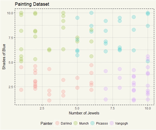
DaVinci seems to have a distinct pattern. Picasso, on the contrary, has some similarities with both Munch and Van Gogh. When the distinction is clear, kNN should be relatively straightforward. So, I’d guess that anything that falls somewhere between Munch and Picasso would be relatively more prone to incorrect prediction.
Next, we will split the data to train and test set, and some other necessary preps.
|
1 2 3 4 5 6 7 8 9 10 11 12 13 14 |
##### Split for Training ##### set.seed(852) size <- floor(0.70*nrow(paintings)) train_index <- sample(seq_len(nrow(paintings)), size = size) #The algorithm will only take predictor variables, #so only the first and second column will be #input into the algorithm. train <- paintings[train_index,1:2] test <- paintings[-train_index,1:2] #Next, we will create the label (as-is) train_labels <- paintings[train_index,3] test_labels <- paintings[-train_index,3] |
Before we create a model, let’s take a look the data that just got separated into train and test datasets and visualize them separately.
|
1 2 3 4 5 6 7 8 9 10 11 12 13 14 15 16 17 18 |
##### Split for Visualization ##### train_v <- paintings[train_index,1:4] test_v <- paintings[-train_index,1:4] ##### Visualize the Split ##### c1 <- ggplot(train_v, aes(y=Shades.of.Blue, x = Number.of.Jewels, col=Painter)) + geom_jitter(size=5, alpha = 0.2) + theme_moma() + theme(legend.position = "bottom") + ggtitle("Train Set") c2 <- ggplot(test_v, aes(y=Shades.of.Blue, x = Number.of.Jewels, col=Painter)) + geom_jitter(size=5, alpha = 0.2) + theme_moma() + theme(legend.position = "bottom") + ggtitle("Test Set") grid.arrange(c1,c2, nrow = 1) |

Just looking at the train and test sets, can you guess what paintings are likely and unlikely to be incorrectly predicted? Keep that in mind…, let’s run the model. For the demonstration purpose (also easier for me,) I’ll set k equals to 1.
|
1 |
knn_model_1 <- knn(train = train, test = test, cl = train_labels, k=1) |
Let’s see the result.
|
1 |
table(test_labels, knn_model_1) |
|
1 2 3 4 5 6 7 |
> table(test_labels, knn_model_1) knn_model_1 test_labels DaVinci Munch Picasso Vangogh DaVinci 6 0 0 2 Munch 1 6 2 0 Picasso 0 1 3 1 Vangogh 0 0 0 8 |
So, it seems like we missed around seven paintings out of 30. Or around 23%.
Since we have separated the correct painter in “test_lables” dataset, let’s combine them together and visualize what paintings the model got them wrong.
|
1 2 3 4 5 6 7 8 9 10 |
#knn_Model merge test_v_1 <- data.frame(test_v,knn_model_1) #knn_model contains only preicted value test_v_1$Correct <- test_v_1$Painter == test_v_1$knn_model_1 #This will return TRUE or FALSE. ggplot(test_v_1, aes(y=Shades.of.Blue, x = Number.of.Jewels, col=Painter, label = Correct)) + geom_point(size=5, alpha = 0.2) + theme_moma() + theme(legend.position = "bottom") + ggtitle("Prediction Results") + geom_text(size = 3, show.legend = FALSE) |

Good, now we know what paintings the model got wrong.
Aha, but that is not so clear. We can do better than that. Let’s create a chart that put data points from train set and incorrectly forecasted data point from the test set together.
|
1 2 3 4 5 6 7 8 9 10 11 12 |
knn_1_vis <- full_join(train_v,test_v_1) ggplot() + geom_point(data = subset(knn_1_vis,is.na(Correct)==TRUE), aes(y=Shades.of.Blue, x = Number.of.Jewels, col=Painter), size=4, alpha = 0.2) + geom_point(data = subset(knn_1_vis,Correct==FALSE), aes(y=Shades.of.Blue, x = Number.of.Jewels, col=knn_model_1), size=6, alpha = 0.8) + theme(legend.position = "bottom") + theme_moma() + ggtitle("Taking a Closer Look") |

Now we can clearly see why they are wrong. For example, the giant red dot is classified as painted by DaVinci, but in fact, it was painted by Picasso. Why is that? Recall that the algorithm will use the Painter from the smallest Euclidean distance. So in this case, there are a couple of dots close to the painting:
|
1 2 3 4 5 |
knn_1_vis %>% filter(is.na(Correct)==TRUE) %>% mutate(Euclid = round(sqrt((2-Number.of.Jewels)^2+(5.3-Shades.of.Blue)^2),2)) %>% arrange(Euclid) %>% head(5) |
|
1 2 3 4 5 6 |
Number.of.Jewels Shades.of.Blue Painter Painting.Name knn_model_1 Correct Euclid 1 2 4.6 DaVinci D <NA> NA 0.70 2 1 5.3 Munch CF <NA> NA 1.00 3 1 5.1 Munch CA <NA> NA 1.02 4 1 5.6 Munch CY <NA> NA 1.04 5 2 4.2 DaVinci K <NA> NA 1.10 |
The algorithm then will pick Painting D as the winner whose painter is DaVinci. Consequently, CW’s painter is then predicted to be “DaVinci.” Now, choosing K is somewhat more art than science. There is a tradeoff between higher K and lower K. The higher the K, will decrease the variance and neutralize the impact from noisy data. But too high K will ignore the significant but small pattern.
Suppose we set k to be the same as number of observation, well, in that case, the variable that has the highest representation in the train set, will always win, ignoring the “nearest neighbor.”
On the other hand, if we set k to 1, the nearest neighbor to a given data point will always win.
Textbooks suggested the square root of the observations. Therefore, in this example, it is \(\sqrt{70} \approx 8\). Let’s try that.
|
1 2 3 4 5 6 7 8 9 10 |
knn_model_8 <- knn(train = train, test = test, cl = train_labels, k=8) table(test_labels, knn_model_8) #knn_model contains only preicted value test_v_8 <- data.frame(test_v,knn_model_8) #This will return TRUE or FALSE. test_v_8$Correct <- test_v_8$Painter == test_v_8$knn_model_8 knn_8_vis <- full_join(train_v,test_v_8) |
Let’s visualize the result.
|
1 2 3 4 5 6 7 8 9 10 |
ggplot() + geom_point(data = subset(knn_8_vis,is.na(Correct)==TRUE), aes(y=Shades.of.Blue, x = Number.of.Jewels, col=Painter), size=4, alpha = 0.2) + geom_point(data = subset(knn_8_vis,Correct==FALSE), aes(y=Shades.of.Blue, x = Number.of.Jewels, col=knn_model_8), size=6, alpha = 0.8) + theme(legend.position = "bottom") + theme_moma() + ggtitle("Taking a Closer Look - 2") |

This time we missed only 6 paintings. The painting from the previous example was correctly classified this time. 🙂
Come to think about it… what if there is a tie? I mean is the painting correctly classified due to unanimous vote? Let’s see.
|
1 2 3 4 5 6 |
#Calculate Euclidean Distance knn_8_vis %>% filter(is.na(Correct)==TRUE) %>% mutate(Euclid = round(sqrt((2-Number.of.Jewels)^2+(5.3-Shades.of.Blue)^2),2)) %>% arrange(Euclid) %>% head(8) |
|
1 2 3 4 5 6 7 8 9 |
Number.of.Jewels Shades.of.Blue Painter Painting.Name knn_model_8 Correct Euclid 1 2 4.6 DaVinci D <NA> NA 0.70 2 1 5.3 Munch CF <NA> NA 1.00 3 1 5.1 Munch CA <NA> NA 1.02 4 1 5.6 Munch CY <NA> NA 1.04 5 2 4.2 DaVinci K <NA> NA 1.10 6 1 4.5 DaVinci O <NA> NA 1.28 7 3 6.2 Munch CL <NA> NA 1.35 8 2 3.9 DaVinci E <NA> NA 1.40 |
There are ties uh oh. According to the documentations (link 1 and page 178 in link 2), then R will randomly break the tie.
kNN algorithm from the Class package is an excellent start to the algorithm. But there are many versions or iterations of the algorithm. For example, instead of using the voting systems or random data point to break the tie, some author added the weight into the calculation.
TL;DR… kNN() is an effective algorithm and very easy to deploy and tune.